
The art of professional layout: secrets, practices and mistakes to avoid
Professional pagination is different from common pagination. A book, a catalog, or a magazine communicate, obviously. They communicate through content, certainly, but they also communicate through the quality of the layout.
So, how can one create a professional layout? How can contents be displayed in the best possible way and communicate a high-level editorial (or corporate) image?
This article aims to examine the best pagination practices, highlighting the most common flaws, and offering strategies to overcome them.
Intended for aspiring professional layout artists, but equally useful for publishers, entrepreneurs, or authors seeking an ideal exposure.
Consistency and Simplicity
Simplicity is one of the pillars of an ideal layout. A simple layout is elegant and communicates clearly and directly, akin to a frank and precise conversation.
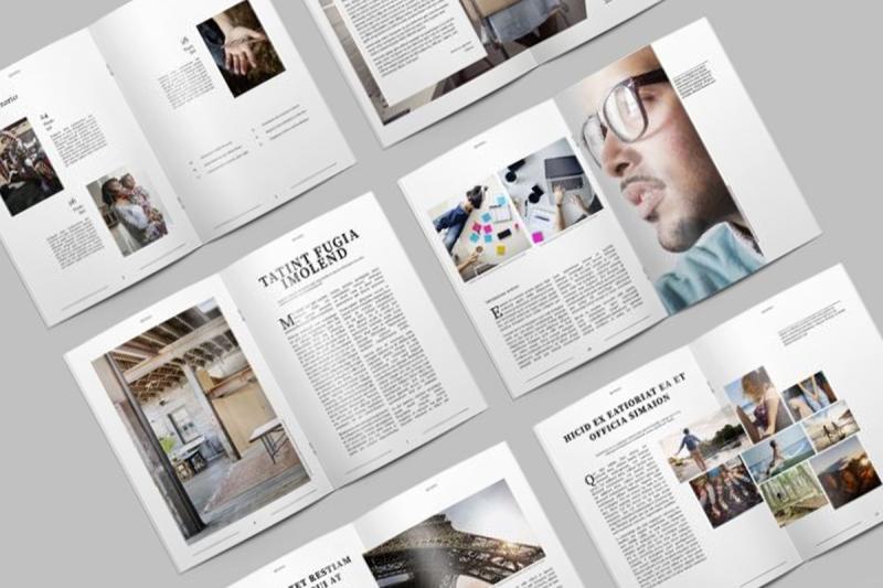
The integration of text and images to create rhythm and form a cohesive and compact whole could be considered the other main "secret," its close relative.
However, achieving simplicity and integration is not an easy task; it requires refined strategies over the years. Here are some fundamental approaches.
Graphic Design
To create a professional layout, it's necessary to have a well-defined graphic design. Without a solid graphic design, pagination loses its essence. In fact, if there isn't a defined design, at the very least, there needs to be an overall style, a comprehensive intention, coordinated elements.
"Simple and essential" layout reduces to this: adapting textual and graphic content following a pre-existing design, applying defined typographic criteria, resolving any issues, and preparing the file for print or digital publication.
The professional layout artist must understand the logic and creative sense of the work they are handling to consistently make necessary changes and adjustments.
Returning to the starting point: there should be a well-defined graphic design that evolves from primary concepts, progresses through a general concept, and concludes by defining stylistic features.
Progressively, this design delves into details, starting from the page structure, defining margins and columns, outlining character, paragraph format, and line spacing.
The graphic design sets the tone for illustrations and graphics, general proportions, the use of white space, headline layout, and caption placement. Furthermore, it packages main pages, selects paper type, and printing technique.
These are decisions made by the designer or graphic designer. Practical pagination interprets, adapts these decisions, and resolves any arising problems.
Professional Pagination
The actual pagination phase, at the center of this article, represents the moment when content takes its final form. Corrections and adjustments (often complex) happen here, and the work is prepared for print or digital publication.
The line between design and pagination can be subtle: pagination sometimes requires stylistic choices typical of design. In some cases, design itself is associated with pagination, especially in simpler tasks or upon the request of small clients.
Occasionally, in the pagination process, specialists are involved in image processing, photo editing, assessing print proofs, and text editing. These contributions provide corrections or guidance to the graphic designer, designer, and layout artist.
For this reason, I acknowledge some overlap of these terms: graphic design and pagination. I do so because, especially in the reality of small graphic studios and smaller businesses, roles and tasks often blend.
However, it's important to emphasize this distinction because understanding these differences constitutes a fundamental step toward professional pagination.
A professional layout artist must grasp the inherent logic and creativity of the work they are handling, allowing for consistent changes and adjustments, which are always necessary.
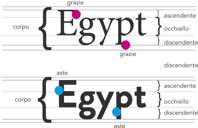
Typography and Font Management
Professional pagination acknowledges the communicative potential of typography and its weight in the overall harmony of layout. Choices regarding font styles are the responsibility of the designer, but the layout artist might have to intervene for some adaptation or modification not initially anticipated, so it's useful to understand its principles.
The 'old' teaching preached caution in using fonts, suggesting limiting their variety and avoiding excessive creativity. These suggestions remain valid, but to stand out from mediocrity, it's essential not to remain too attached to them.
Despite a cautious approach, a professional layout artist explores new font types, going beyond the usual clichés like Times, Garamond, or Helvetica, but always judiciously.
The wide availability of fonts can be overwhelming, requiring a lifetime to understand their peculiarities, style, how and when to use them, or effectively combine them. However, a professional layout artist must occasionally step out of their comfort zone, abandoning established choices.
As graphic designers, we have the task of developing a personal style for the client. As layout artists, we must understand the logic underlying these choices.
Many jobs often require a style that, unfortunately in most cases, proves conservative and lacking in originality. Therefore, I assert that an extra touch of originality and functionality is a true ingredient of professional pagination.
This requires study, practice, and therefore, layout work, with a solid graphic design behind it, can be more time-consuming.
When creating books or magazines, designers should move beyond the common use of fonts like Garamond. While excellent, a font used in 90% of cases does not contribute to the personality or style of the work.
Therefore, we must think outside the box and consider options like Baskerville, Caslon, or a more modern version of Garamond, as well as more linear types like Gill Sans, Open Sans, or Avenir. These are just a few examples among countless possibilities.
It's worth considering that new font families, modern and more comprehensive, offer a touch of freshness along with a wide range of glyphs, the individual symbols corresponding to letters, numbers, punctuation, and special characters.
However, the layout artist must be aware of technical limitations: many fonts have a limited set of glyphs, causing issues in writing different languages or special symbols like mathematical ones.
During pagination, it might be necessary to load a different font of the same type. In some cases, fonts without an italic version might require a review of typographic choices, opting for a more complete family.
A professional graphic design usually combines no more than two or three font types, a good principle to follow, but rules are also made to be broken, especially in the field of creativity.
For books, this rule stands firm, while in magazines, the employed fonts might be more numerous, but always in relation to the complexity of the content.
A professional job should never rely on excessive font variety, solely aiming at aesthetics or liveliness. The goal is to avoid school rules to elevate pagination to a professional level.
Professional Pagination and Text Alignment
In the realm of professional pagination and graphic design, various solutions for paragraph alignment are explored.
It may seem almost sacrilegious to propose left-aligned text to the client. The clean and orderly appearance of justified text, with uniform lines, often receives great approval. However, left alignment offers numerous 'technical' advantages, gives a more distinctive style, and in some contexts, is even indispensable.
In the case of narrow columns, justified alignment can create excessively wide spaces between words, even if hyphenation is correct. The fact that many do not find this arrangement bothersome remains a somewhat unexplained mystery to science.
In books, where text usually occupies a single column, justified alignment can be fully utilized. However, in books or magazines with multiple columns, a more cautious approach would be advisable, to use a euphemism.
The forced uniformity of lines, similar to a military parade formation, is not necessarily aesthetically pleasing or functional, although it can be very... regimented.
Generally, therefore, with wide columns, justified alignment works well, while with narrow columns, left or ragged alignment is preferable.
Regardless of the chosen option, it's advisable to use automatic hyphenation. There's no shame in this; Italian grammar allows it. Words are automatically and correctly broken by the software (provided the correct language is selected). Never, I repeat, never manually separate words by inserting hyphens from the keyboard.
There are correct ways to adjust or influence hyphenation according to needs. Every serious word processing or layout software offers this functionality.
Widows, Orphans, and Other Typographic Complexities
In professional pagination, isolated lines of text are relentlessly eliminated. In this paragraph, we will explore peculiar aspects related to pagination.
I often continue to confuse the terms 'widow' and 'orphan' because both denote a similar problem: isolated lines at the beginning or end of a page. These single lines are among the most unpleasant things to find in a text.
Similarly, though to a lesser extent, individual words or a few letters left alone at the beginning or end of a paragraph are disagreeable. The maximum undesired effect is reached when a footnote remains isolated at the start of a line, often caused by separation with a space between the word and the footnote number using the space bar.
There are various professional adjustments to solve these problems, becoming more refined as one gains experience. These tricks include minimal adjustments to letter spacing (tracking) or a very slight (I emphasize, minimal) horizontal distortion of the character.
It is also possible to add 'tie characters' or force hyphenation using 'optional hyphens'. These methods allow adding space between characters without disrupting the word's continuity.
In the case of images within the text, one can play with their sizes or the space between captions so that the text flows harmoniously, favoring the creation of pleasant white spaces that seem deliberately designed, although we know it to be a clever stratagem.
The addition of quotations and the careful articulation of captions fall among professional tricks. The goal is not to densely fill the page but to gain complete control of the text flow, creating harmony and beauty, facilitating reading, and enhancing the content.
Role of White Spaces in a Professional Graphic Design Project
In the context of a professional graphic design project, white spaces do not represent emptiness but an essential element of graphic composition. The professional layout artist often deals with this aspect, although the overall style is defined by the designer.
Carefully placed white space on the page conveys a sense of order, importance, and makes reading easier and more relaxing. In short, this 'absence' serves various functions.
It is preferable for a paragraph title to be placed at the beginning of the page or column, avoiding leaving it alone or with a few lines at the end.
Avoid using indents (with the 'Enter' key) or white spaces (space bar) to create additional spaces between paragraphs or between individual words and letters.
Even the forced use of 'shift+enter' for the indent causes unwanted effects, carrying along paragraph formatting.
The correct way to create space is to set a distance before and after the paragraph in formatting. The advantages compared to using the 'Enter' key are numerous:
- The use of paragraph styles (strongly recommended) automatically applies space, saving time and reducing errors.
- If the text flows, and the paragraph positions at the beginning of a new column, the initial space is not applied, maintaining uniform formatting.
- Any spacing can be applied, not limited to multiples of the line spacing.
- In the case of eBooks in ePub format, the spacing is respected.
To create additional white space between words and characters, it is advisable to adjust letter spacing or use special tie characters added through software that are never broken.
Excessive Emphasis: Balancing Highlighting
A book or magazine should communicate rather than simply showcase stylistic experiments. The term 'excessive emphasis' denotes using multiple contemporary modes to highlight a paragraph, such as the simultaneous use of 'space after' and indentation (preferably one or the other).
It's akin to concurrently using italics and bold or using quotation marks around words already in italics. One should opt for quotation marks or italics, bold or italics, but not both.
Professional pagination relies on a limited number of tools to emphasize specific parts of the text. This is what is meant by a 'clean layout,' in addition to adhering to an organized structure.
In this regard, I would recommend a style manual like Zingarelli's. Detailed and precise, it provides clear and comprehensive guidelines.
Perhaps, the keywords here are 'simplicity' and 'consistency.' Highlighting many words presuming to give them different weight or meaning traps the reader.
The reader is neither naive nor a machine. To a certain extent, they must determine for themselves what is important and what is not, without pondering over the reason for a term in italics, another in bold, or why a phrase is enclosed in quotation marks.
Excessive emphasis would only lead to misunderstandings and make reading more cumbersome.
The Cage in Professional Pagination
The 'cage' in pagination offers an order that generates rhythm, contrast, and at times, even controlled disorder. This design choice overlaps with the work of the layout artist, requiring a complete understanding to arrange elements coherently.
The cage adds rhythm, order, and predictability, while also occasionally allowing for elements of surprise.
How can we 'think outside the box' if we don't have boxes? Without them, what we call vibrancy is mere chaos. The typographic cage represents the framework, not the prison of Alcatraz. It imposes limits and, at the same time, suggests creative ways to surpass them.
Every layout, however simple, implies a framework, the cage, so to speak, in graphic terms. It's present even in a single-column book: margins, spaces between titles and main text, areas designated for images.
In magazines, cages are often more complex, composed of columns, subsections, and horizontal areas. Blocks of text, images, and white space move like pieces on a chessboard, seemingly random but actually rigorously structured.
The cage sets the rules but allows - and sometimes demands - some exceptions. While an inexperienced graphic designer may see only impositions, the professional perceives coherence in the message and suggestions, seizing the right moment to intelligently break them.
Professional Pagination and the Golden Ratio
The 'golden' or 'divine' ratio, represented by a ratio of 1:1.618 between two measures, is based on the idea that a number in a sequence is the sum of the two preceding numbers.
In the sequence 1, 2, 3, 5, 8, 13, 21, 34, 55..., as it progresses, the ratio between the last two numbers tends more and more towards 1.618. This ratio has been widely used in the arts, from graphic design to architecture, since ancient times, and is also found in nature.
Often considered a kind of 'cosmic' perfection, the golden ratio is used in graphics to determine the dimensions of the text frame or column layout. For example, in a book, we might have a text frame that's 12 cm wide and 12 x 1.618 = 19.4 cm high.
However, nowadays, more compact formats are often used, and this is not an error unless it stems from ignorance or carelessness. A pocket-sized book, for instance, is only such if it follows a similar ratio; otherwise, it's merely a smaller-sized book.
The golden ratio is a tool, not a mandate. It's not necessary to strictly adhere to this proportion, but it's possible to do so. It can be used in defining page or main text frame sizes or as a guide for organizing elements.
To simplify, one can adopt the ratio 8:13, which is the basis of the rule of thirds, or the ratio 2:3. These very similar ratios are widely used in graphic arts.
This explains why a page divided into three columns, with images occupying 1 column (1/3), 2 columns (2/3), or 3 (3/3), appears aesthetically pleasing and interesting. Professional pagination consciously utilizes these proportions without becoming enslaved to them, rather leveraging their consistency.
This consideration reflects the concept that the number three is perfect, in line with the Golden Rule. All this shows how art is intertwined with well-founded principles, not mere whimsical caprices.
Resolving Errors in Pagination: A Fundamental Task
Correcting a layout, if done correctly, should primarily address errors that escaped the author during text revision. Despite thorough editing, it's common for some errors to persist.
During the pagination process, errors can occur, including those generated by the author themselves, such as improper use of hyphens for hyphenation or frequent pressing of the 'return' key. Even small details, like adding inappropriate spaces before quotes or punctuation, are common errors.
Additionally, changes from uppercase to lowercase or variations in writing styles for acronyms introduce new possibilities of error during the pagination process.
Therefore, conducting thorough checks to identify and correct these errors during the pagination phase is essential.
While not a novelty, it's essential to reiterate that a text should be free from grammatical errors and typographical mistakes. Perfection is hard to achieve, and almost no layout is without errors.
Some articles on proofreading have been extensively covered on this blog. However, I would like to highlight some essential aspects. Firstly, checks performed on paper are more effective than those done on-screen.
Before proceeding to a paper review, it's advisable to address the errors identified on-screen to avoid toner wastage. Nevertheless, conducting an intermediate review using the PDF format is useful.
Reviewing a PDF on-screen is more accurate than direct viewing on layout or word processing software (such as InDesign or Word) because the PDF version lacks guides, panels, and other interferences.
Personally, I find the 'presentation' mode in InDesign very useful. When unable to spot errors on-screen anymore, I proceed with printing and conduct further checks, preferably the next day or even better, after two days.
Another fundamental aspect of professional pagination is the thorough use of available software tools. Utilizing spell check, search/replace functions, and for the more advanced users, GREP styles, are essential for identifying and correcting errors.
Moreover, using the text-to-speech function available in programs like Word can be helpful, focusing on listening to the text rather than visual reading.
Errors often stem from rushed work. Therefore, it's advisable to complete significant work at least a week before the scheduled printing or publication date.
Preparing for Printing: Paying Attention to Less Obvious Details
When preparing for printing, often overlooked details could have a significant impact on the final result. While printing primarily reflects what appears on the screen, it's crucial to pay attention to some commonly underestimated aspects.
A critical aspect concerns the color of the main text, which should be composed solely of basic black. It's frequent for texts imported from Word to have black composed of multiple colors, causing misaligned overlaps during printing, especially in smaller text sizes.
Another point to consider is image resolution. Photographic images should be high-definition, preferably between 200 and 300 dpi to ensure quality printing. Images like logos and symbols should be vector-based since the classic 300 dpi is insufficient to guarantee maximum print quality. Vector formats, typically, are printed at a resolution of 2500 dpi in professional printing machines.
In addition to these technical details, it's crucial to pay attention to possible glaring errors before commencing printing:
- Main titles with spelling mistakes
- Indexes with incorrect page numbers
- Incorrect codes, copyright information, or periodicity
- Pages without numbering
- Headers not matching the content
- Missing text or images
While an error in a caption might be forgivable, an error in a title could cause serious issues.
The most dangerous oversights often concern neglected yet critical aspects. It's advisable to perform manual checks since even with automatic or semi-automatic means, completely eliminating the risk of errors is impossible.
Professional pagination leverages advanced software functionalities to conduct thorough checks, such as using variables to ensure consistency in headers, page numbers, and references.
Lastly, an important consideration: don't fear spotting errors, don't be ashamed to do so, and don't feel guilty. Finding errors is an integral part of the process, and often, the most critical person is also the most prone to making them.
Final Thoughts
Layout of a book or magazine might seem within the grasp of anyone, much like building a brick wall. However, the real challenge lies in creating work of quality and precision, much like a perfectly aligned and well-built wall. I aim to delineate this distinction in this article, avoiding delving too deep into details, considering I've already individually covered many of the mentioned topics.
Clients are becoming increasingly demanding, and software technology continues to advance, but the important question is: Is the professional, whether a graphic designer, a layout artist, or a designer, adequately prepared to face these challenges?
Not always, but they should be. A prepared professional would not only derive more benefits and enjoyment from their work but also ensure the client receives a valuable investment and lasting satisfaction.
Wishing everyone success in professional pagination!
When you subscribe to the blog, we will send you an e-mail when there are new updates on the site so you wouldn't miss them.
About the author
By accepting you will be accessing a service provided by a third-party external to https://www.insightadv.it/


Comments