
Why the Landing Page is important in a marketing strategy
If you are thinking of activating advertising campaigns or other ways of Digital Marketing, which lead users to your site "to then take some action", I suggest you invest some of your time and read this article on the importance of a page landing page (or landing page) specifically designed to persuade users to take the actions you want.
In the article we also see together how to create an effective landing page and some practical examples, able to guide you in the correct setting of a successful digital product.
Definition of Landing Page and its purposes
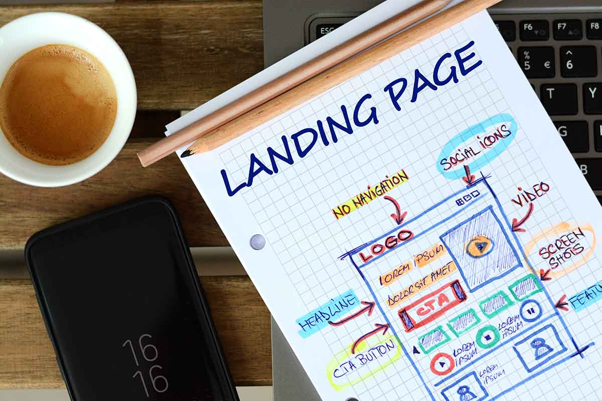
As frequently happens, in the marketing field we are dealing with Anglo-Saxon terminologies and definitions. Literally translated into Italian, a landing page is a landing page or landing page . In practice it is a web page, whose structure is designed in such a way that the user's focus is concentrated on a certain action to be performed (defined conversion ).
For example downloading a pdf, requesting information, buying a product and so on.
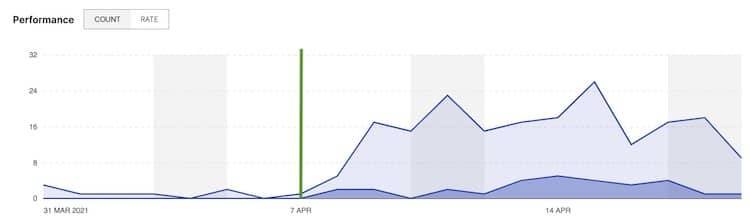
Does this seem like an unimportant distinction? Is it clear what you do and what you offer on the other pages of your site or on the home page? I answer these typical questions with a practical example taken from an advertising campaign. In this example, through April 7, the ad campaigns targeted the company's homepage. From 7 April the landing page – finally completed – becomes the new destination for users. And the results, suddenly, begin to arrive…
For this reason, an effective landing page should be as reasoned as possible, "clean" from the point of view of design and user experience, have well-studied text and well-defined requests for action .
The term "landing page" can be further divided into two other types of pages depending on the purpose: the squeeze page and the sales page. Let's see them.
Squeeze page
These are the most recurring conversion pages. They are generally made up of those contact forms that appear at the end or in correspondence with a video or article. The squeeze page can also appear as a popup (but it's quite annoying), or as a widget on the side of an article.
The purpose of the squeeze is to collect user contacts in order to establish relationships that can subsequently lead to the sale of products or services.
This type of landing page is really useful as a first contact with a user, but for it to be effective, I recommend limiting the information requested.
For example, if in this phase you don't necessarily need to know your name, surname and mobile phone , you could limit yourself to requesting just the email.
The less information you ask, the easier it will be for the squeeze page to convert. Remember that digital marketing is all about continuous optimization, in one of the next articles (promise!) we will see how to create effective contact forms that convert.
Sales page
Compared to the squeeze page, the sales page is based on the final sale of products or services . When the user is ready to buy (near the end of the decision making process), they go to the catalog or pricing page. The sales page focuses all the attention on the sale of a product/service without too many other distractions (for example the reference to external links). The landing page copy must be clear and convincing (we'll talk about it at the end of the article) and the graphics must also be clean and simple.
Let's take an example to better understand the difference between the squeeze page and the sales page, taking the classic funnel made up of 4 videos .
- The first video is generally created to intrigue users and ask them to fill out a contact form to access the next three videos. This contact form is the squeeze page (also called opt-in page). By doing so, a first result is obtained, i.e. the user's contact.
- The other three videos are created with valuable information content , aimed at convincing the user to purchase other content. At the end of the three videos, an offer is made (generally discounted), which can be purchased right on the sales page.
Difference between landing page and info page
Take for example this blog article you are reading. It is an information page , created specifically to offer information relating to a specific topic. It is not a landing page, even if it is possible to put a popup or an information request form somewhere.
Compared to a landing page, an information page has the main objective of deepening a topic , has external links, does not require specific actions and has a lot of content. As we will see better shortly, however, a landing page is focused on requesting data (mail, name...) or on performing specific actions (download, buy...)
The purpose of a landing page: to convert
As you may have already guessed, the main purpose of a landing page is to convert a user into a contact. A site that doesn't convert doesn't make much sense for business .
If you sell products or services, you can do paid advertising, directing users to your main pages or maybe you can focus on SEO to position yourself among the first search results, but if in the end what matters is that visitors buy your products or services, then landing pages are of paramount importance.
On the other hand, pushing a user to buy something from your site until they're motivated enough to do so and don't trust you would not pay off.
It would be better to go step by step starting to ask, for example, for the email address, to send informative material and establish a relationship with the user . Again, since you're asking the visitor to take a specific action, you'll need a landing page.
The structure of an effective landing page
A landing page that converts should have a clean layout (in the sense that it doesn't offer too many inputs), well thought out for mobile, with a satisfying user experience, fast (also essential for SEO positioning) and a compelling copy . But sometimes that's not enough and so other stimuli are added, such as the ability to write your own comment and reviews as social proof . Let's take a closer look at some examples of how an effective landing page is made up
Title and subtitles
The title is what attracts the user's attention (after the photo ) and which convinces him or not to continue reading. Any ad, product or service should have a concise yet descriptive title that includes the problem or need the user wants to solve.
For example, if you're on a hair dryer buy page, the title should highlight the product, perhaps the brand, and one of its beneficial features. In our example: "Very low consumption hairdryer XYZ" (need to dry hair and save electricity).
Images and videos
An eye-catching image is ideal for attracting the user's attention and – compared to video – offers a concise and instant message . Returning to our example of the hair dryer, we could use the image of the product inside a portable case, which immediately makes it clear that it is an ideal hair dryer for travellers.
The video, on the other hand, offers more details on the product and, if done well, is able to involve the user better than any other content. Involving the user is an excellent strategy for decreasing resistance to buying and lowering the natural and implicit defenses of any user or potential customer. The videos should therefore be inserted in the product sheet or in the information sheet of the service.
The content of the landing page
The content of an effective landing page must be short but descriptive and above all must concern the offer.
The content of a blog article delves into a certain topic, so it's okay for it to be long and have different inputs.
Conversely, on a product's landing page, you should accurately describe the features only in order to convince the user to make the purchase .
Returning to the example of the hair dryer, the user arriving on the landing page could be in the phase of "comparing" our hair dryer with that of the competitor. If we are better and more convincing we are more likely to sell our product. For this reason, the content on a sales page must be focused exclusively on the offer and on the winning characteristics of the product , without too much dispersion.
The testimonials of other customers (preferably in video or with a photo), help new customers because they identify with other people with the same or similar needs already solved thanks to that product or service. Reading or hearing testimonials from other people who had the same problem and understanding how your product/service could solve it helps new customers trust you. It's called the social proof effect . You can place testimonials either on the sales page, before or after any money back guarantee, or on the squeeze page. In the second case, it helps to receive more contacts from new potential customers.
Comments, especially if they are too many, tend to lengthen the landing page, with the risk of losing focus. Returning to the example of our hair dryer, testimonials could be useful enough. But on the other hand, you might want to add comments related to a product or service as well. In this case, our advice is to insert them under a retractable label , where the interested user can click to read them.
Call To Action: calls to action
CTAs are part of the fundamental aspects of the structure of a landing page . CTA is the acronym of Call To Action, that is call to action and is generally identified in the form of clickable buttons (the classic "Contact us", "Click here", etc).
Strategically inserting buttons with clear and defined CTAs on the landing page allows the user to perform the desired actions and thus obtain conversions. The stylistic choice of the CTA is also of great importance during the purchase phase . The color, shape and size of the button make it more or less visible to the user, decreeing its effective effectiveness. Even a link is a small CTA, because it invites you to click on it to navigate to a web page
In our example of the hair dryer, once the user is convinced to make the purchase, he will have to add the product to the cart or go directly to the payment page. In this case, strategically inserting CTAs such as "add to cart" or "buy" on the landing page will be decisive for the sale of the item.
When you subscribe to the blog, we will send you an e-mail when there are new updates on the site so you wouldn't miss them.
About the author
By accepting you will be accessing a service provided by a third-party external to https://www.insightadv.it/


Comments