
How to choose the right font for a project?
How many times have you found yourself having to decide which font to use ?
How many times have you started looking for the best font for your project by scrolling through the font menu for hours, rummaging through hundreds of fonts you've downloaded or purchased?
Want to know how to choose a perfect font for your project?
Then this is the article you were looking for.
It'll help you in those moments when scrolling down the font dropdown in Illustrator or Word seems like your one and only hope.
After reading this article, you will definitely get a clearer picture not only for the project you are working on but also for all future projects.
Do not you believe it? F ollow me and I'll provide you with information and advice on choosing the right font !
Choosing a font: why is it important to do it right?
Deciding which font to use is a very important, sometimes almost essential, part of the creative process and the success or failure of an entire project may even depend on this decision.
An example: do you think Obama's famous 2007-2008 advertising campaign for the presidency (the famous “ Yes we can! “) would have been so effective without the Gotham font? I think no.
The same goes the other way around too, when it comes to bad font choice.
How many times do I see flyers, signs or logos accompanied by fonts that, in the best of cases, don't get us right with the message to be transmitted, while in the worst cases, in addition to not getting it right, they are also objectively ugly . All this is due to poor management and choice of font in the design phase.
What's your goal?
The first step you need to take in choosing the right font is to have a clear and definite idea of the reaction you want to arouse in the reader or customer with whom your text will interact. This should be your focus and should drive your process.
The definition of the type of reaction to the message transmitted through the font can be decided independently, by the client or by meeting with the client in the design briefing phase. It all depends on the type of project.
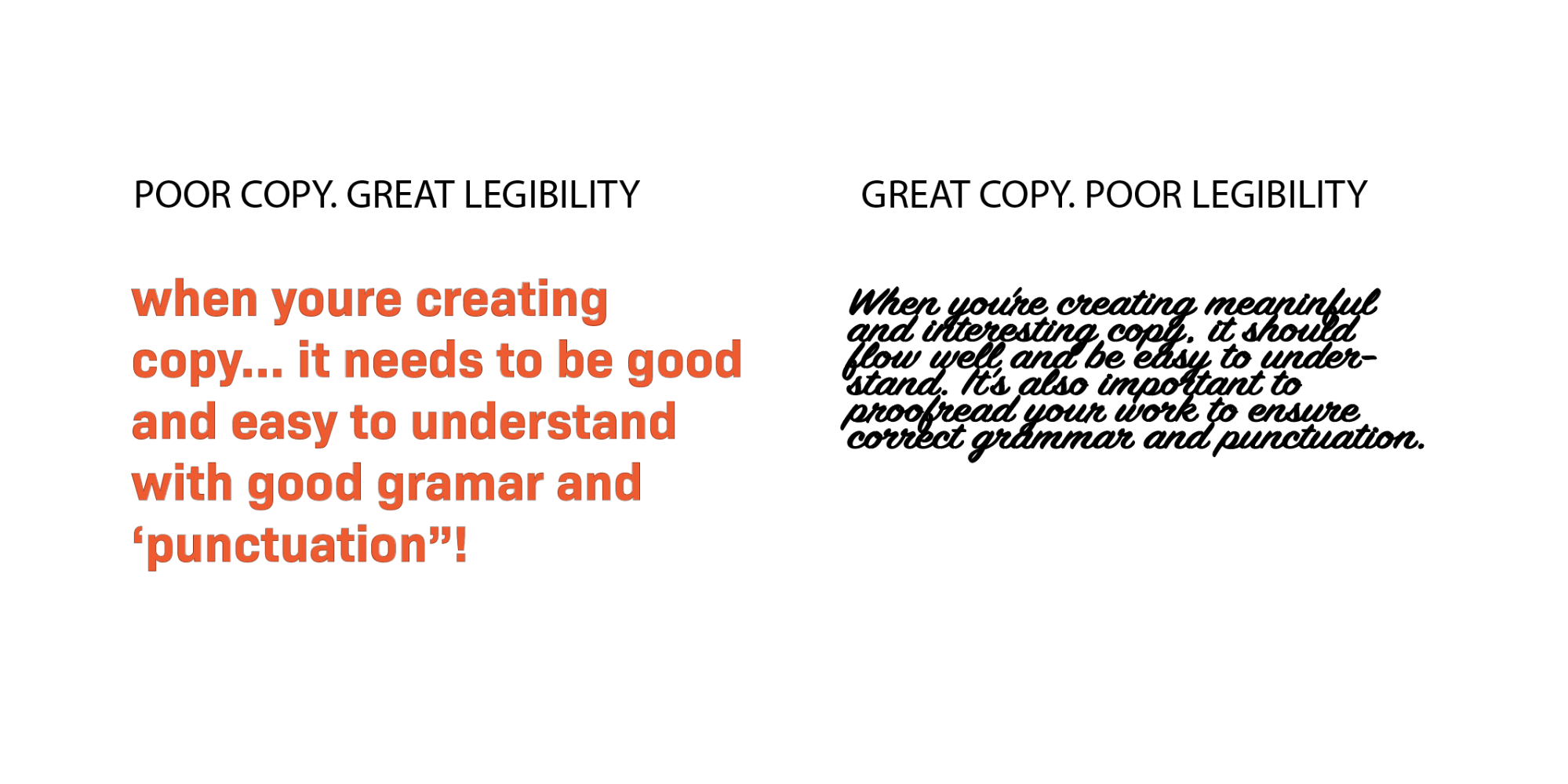
While a large part of the selection process is something extremely linked to personal subjective choices of taste and state of mind to convey, there are objective and more or less quantifiable elements , such as the degree of readability of a font and legibility of the text.
Let's clarify. Douglas Bonneville, graphic designer, defines in two words the characteristics relating to a person's interaction with a text: legibility and readability.
These two words are synonyms and one might think that they have the same meaning, also because in Italian they both translate as "legibility". But they are actually two very different terms.
Legibility or legibility of a character
Legibility is that characteristic that in Italian we could define as " legibility of a character " while readability is the " legibility of a text ".
Legibility is something that has strictly to do with the graphic structure of the individual typeface such as weight, serif, kerning, spacing, or line spacing ( things I've talked about here and here ).
It is an objective characteristic and not linked to a person's personal tastes and it is therefore easy to define the legibility of a character. For example, a decorative or calligraphic font does not have good legibility because it is designed to be attractive at first glance and not in long texts. Instead, if you notice, the fonts used in books, newspapers or online articles are extremely easy to read.
When choosing the font , you then need to decide how much legibility you need.
If you need an extremely readable font, consider these tips for excellent readability :
- Choose typographic characters with conventionally shaped letters, in fact all those fonts that have letters with strange and unusual shapes, perhaps with a thousand decorations and doodles, even if they are beautiful and useful for attracting attention, do exactly that, they attract attention! If, on the other hand, you need readability, look for the standard forms in the letters.
- Choose typefaces with good spacing . Fonts whose letters are too close together create a very difficult and slow reading, so they are to be avoided in this case.
- Choose fonts whose characters have a high eye-to-body ratio . The eye, or height of the x, is the height of letters such as x, a, c, o, etc. The body is instead the total height and therefore also considering ascending and descending rods. But I'll explain these terms better in this article . In any case, a high ratio (I would say between 0.4 and 0.6) between eye and body guarantees excellent legibility, as in the case of Verdana.

Readability or legibility of a text
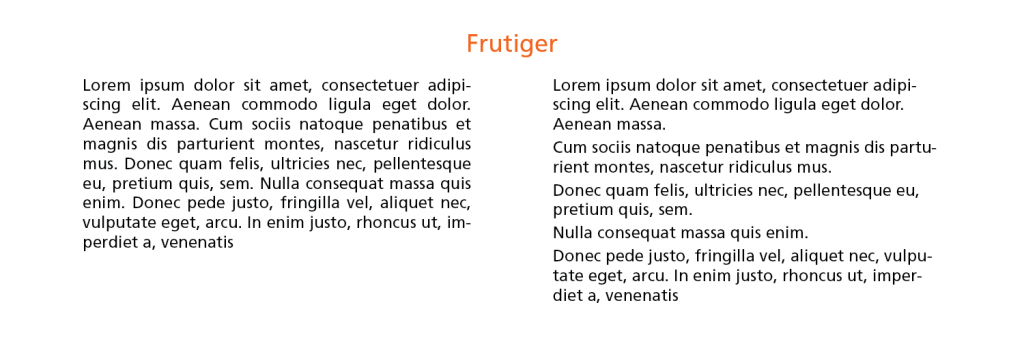
The way in which a text is set, combined with the level of legibility I just told you about, leads to a certain level of readability , i.e. the legibility of a text.
When we talk about the readability of a text we are talking about all those characteristics of shape, tracking, kerning, color and all the other properties that work together to create an overall aspect that can be more or less readable . For example you may want to obtain a low level of legibility of the text because this factor would be an important element of the message you want to convey, or you may want to give a high level of legibility of the text because the message to be given is complicated and it is better to simplify all the aspects that they surround it.
In any case, communication comes before style and outward appearance. So focus on that.
Using the same font, in this case Frutiger, one of the designers' favorite fonts , but with different text characteristics (justification, line spacing) you can have poor (left) or excellent (right) text readability. The example on the right is much more readable !
If your goal is to obtain high readability of the text, here are some valuable tips :
- Choose fonts designed exactly for the use you need. For example, there are fonts specifically designed for long printed texts, others for titles with a large visual impact, still others for texts that can be viewed without problems on small displays and so on.
- Align text to flag , and possibly left. Therefore, avoid centered or justified texts if you need them to be highly legible
- Divide into paragraphs.
Make the text tidy by dividing everything into paragraphs. This not only improves the visual aspect at first glance but also makes the message to be given clearer, by inserting white spaces ( which are very important! ) and that is "scheduled breaks" for the reader. - Use weights and dimensions correctly.
Fonts with a “roman” or “regular” weight are suitable for long texts because they have a medium thickness (weight).
At the same time, it's important to always use the right size of a font. Think that most websites have text sizes that are too small! - Use line spacing correctly .
If your text spans multiple lines (as obviously in the previous point), you need to make the line spacing value greater than the point size of the font. Usually a line spacing of about 120% of the size of the font size is used, but this is fine in small sizes while it should generally be reduced as the size increases.
Ok, legibility of the font and legibility of the text were the objective and quantifiable aspects in the process of choosing the font but there are certainly aspects that instead concern the appropriateness.
Aspects of suitability of a font
There are no good or bad fonts. There are only fonts that are adequate or inadequate for the project – Daniel Will-Harris
For some areas, one font is more suitable than another. There is no discussion about this. It's a matter of appropriateness , something you can learn both from your personal experience with a font and from analyzing the font's original history and purpose.
Here I want to talk to you about some aspects that can influence whether a font is considered adequate or inadequate. So what makes a good font ?
1. Design purpose
I mentioned it before, now let's dig deeper. Knowing the precise role a font was initially designed for by its creator is certainly one of the best ways to know how to use it.
There are some fonts that have been written or talked about a lot and whose history cannot be ignored. If you use well-defined and well-known fonts such as Cooper Black, Comic Sans, Frutiger or Gotham, you are simply superficial incorrectly and you get the negative effects of creating something superficial.
One way to get as much information as possible about fonts is certainly by searching for them on Google, but also, and above all, by reading books on the subject. Among these, I recommend Simon Garfield's " You're just my typo ", a brilliant book that tells, in an amusing and interesting way, the history and use of some of the most famous fonts ever (there are, for example, all those I have mentioned above).
2. Aesthetic appearance
Another important factor that conditions the level of adequacy of a character is undoubtedly its external appearance, its aesthetics . And I'm not referring to saying "beautiful", "ugly", "I like it" or "it disgusts me". I am referring to the fact that the font you choose will have to conform to the aesthetic expectations of the public with which that font will interact.
For example, if you choose the font for an insurance company, one like Brandon Printed or Vag Rounded, while well designed fonts, will certainly not be the most appropriate because they will not convey the right message to an insurance company's potential audience.
Perhaps a more suitable font for the insurance sector could be an elegant serif such as Minion Pro, or Bembo or Caslon.
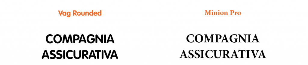
See the difference?
A technique to understand what the message transmitted by a font might be is to write the first words (preferably adjectives) that come to mind when observing it. Once written, ask yourself: are these words consistent with the message I need to convey? Is this font adequate?
3. Mood
You may have already guessed that some definitions overlap each other slightly. This happens especially with regard to the mood aspect which is a sort of dynamic synthesis between the aesthetic aspect of a font and its legibility (both of the character and of the text), but also of the intrinsic message that the written text in a certain font he wants to convey.
The mood of a font is something strongly conditioned by the message that is perceived. For example, a font can convey feelings of excitement, panic or relaxation but, while reading what is actually written, perception can go to another level and the general mood changes (we will explore this topic in an article dedicated to the psychology of fonts).
An example:

As you see here the Vag Rounded could have more to do with the second part of the text while the Impact more to do with the first. It's a matter of mood conveyed by fonts. On the psychology of fonts.
Tip: if you want to create something with a strong mood impact try to think about what the design is with a totally opposite mood. If you can't focus well on an opposite it means that you haven't focused well on the mood you want to convey through the typeface. Also because the opposite of neutral mood… is neutral mood!
4. Personal choices
Obviously, what happens in our creative brain strongly influences our projects! It often happens that, while we are deciding the font to use, we find one that seems immediately perfect to us, in short, we like it.
But my advice is to go easy on the "gut" decisions and always try to do a minimum of research on at least the history and initial uses of that font, to understand how to interact with it.
Researching the fonts used, as well as being a great way to constantly expand your knowledge, is also a way to respond to any criticisms that may be leveled at you by customers or other designers in the feedback collection phase.
In short, an answer to the request to motivate the choice of font with "Dunno, I liked it!" it's never very professional, is it?
Practical advice for choosing the right font
So far, I've talked a lot about the theory behind choosing fonts. I explained which aspects make a font more or less legible and more or less suitable for a project. Now, however, is the time to be pragmatic and cut to the chase.
Here I list a series of very useful practical tips to choose the right font, the most suitable font for your project. These tips are the same used by the best designers in the world, treasure them!
1. Plan a hierarchy
That is, try to understand how much content, how much text you have to write with the fonts you have to select and decide how many characters you need to write that text. For example, you decide that you need one font for titles, one for captions, and one for descriptive text. Do you just need a font that, through its weight or inclination variants, allows you a satisfactory result or do you think it is better to select two or three (preferably no more than three) to ensure greater differentiation?
Understanding your needs and deciding the number and roughly also the type of font to use is a fundamental step that will allow you to proceed in a more orderly way in choosing a font.
2. See what others have already done
This is the kind of advice I give in any area for anything. It doesn't mean copying eh! It means analyzing the market and understanding what has already worked in the past for projects similar to yours and getting inspired by these.
There is no copyright on font combinations, so if you see a winning combination like classic Georgia + Verdana in a project, why not reuse it?
Do you want a very useful pearl in this sector? The Fontsinuse.com site is very useful because it shows you a lot of examples of how fonts have been used by other designers and planners. Yeah, my eyes shone too when I discovered this site!
3. Experiment gradually
Choosing the right font is an important process and not a task to be hastily solved in a few minutes. Take your time and make small, gradual changes. Like an adjustment of a thickness or an inclination and from time to time observe the result to understand what works and what doesn't.
Try to make only one edit at a time to avoid missing out on possible perfect combinations in the rush to edit.
4. Avoid clichés
Avoid those choices so trivial that they almost leave you stunned. Let me explain what I mean better with some examples:
- Don't use the Papyrus just because you're working on something to do with "antiquity"
- Don't use Comic Sans just because you're working on something playful or fun
- Don't use Trajan just because you're working on something that has to do with the Latin or Roman world
- etc, etc
Simply try to avoid those obvious, trivial and objectively ugly choices from the lowest category graphic designer. I ask you with my heart! And if you've done them in the past, never mind! Learn from your mistakes and don't repeat yourself.
5. Use font families
If you need to use more than one font but still need order and to convey the message to be transmitted through a single "mood", then font families are made for you.
Font families are those fonts which, within them, include large variations of weight and width. Such as the Meta family designed in 2003 by Erik Spiekermann which includes 28 different weights and widths or the Univers by Adrian Frutiger from 1956 which had 24.
There are even extended families of fonts that include both serif and sans serif versions, or square and rounded versions and so on.
6. Stick to the standard combinations
When you feel stuck, or maybe you're close to the deadline for your delivery, solve everything by focusing on combinations of fonts with proven validity. I mentioned one a few paragraphs further up and it is Georgia (serif) plus Verdana (sans serif) which are among the most used combinations in the world of the web.
Also because there are fonts that, resigned, will never fit side by side, so you might as well make use of the best combinations of fonts, right?
7. Play it safe with the most popular fonts
The logical consequence of the first point is to make use of the most popular fonts, whether they are the designers' favorites or the best-selling ones ever, it doesn't matter. Very often the most loved and widespread fonts have reached that level of diffusion thanks to their incredible intrinsic qualities. Take advantage of it without feeling guilty!
You can also create your own list of fonts that have given you the best professional results and update it from time to time with the best “discoveries” in this area.
Final rule: break the rules!
Having a good understanding of the rules described in this article allows you to understand which rules you can break and how to do it. It's also a way to stand out and make your project unique and recognizable.
Think outside the box! But only after you understand how those patterns work.
When you subscribe to the blog, we will send you an e-mail when there are new updates on the site so you wouldn't miss them.
About the author
By accepting you will be accessing a service provided by a third-party external to https://www.insightadv.it/


Comments