
What is the design hierarchy? The most important weapon for us designers.

Design hierarchy is the organization of elements on a page or in a project to guide the eye of the viewer and create a certain look and feel. It is an important weapon for us designers because it helps us to give the right importance to the various contents that make up a layout, from the highest to the lowest priority. Captivating graphics can also intrigue and attract users, but the right arrangement and elaboration of the elements prompts the eye to easily perceive the most useful and important information.
In this article we will see what the design hierarchy is, but above all we will learn how to create a visual hierarchy that on the one hand facilitates the reading of the contents and on the other allows the designer to give dynamism and fluidity to the layout, capturing the reader's attention .
What is hierarchy in design?
Visual hierarchy is a design foundation that has a huge impact on user experience.
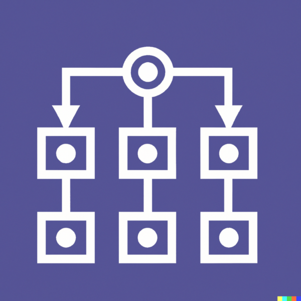
It is the order in which a user processes the contents of a page: the element that first catches the eye is at the top of the hierarchy.
Thinking about the methods of enhancing the various elements, one tends to immediately think of the dimensions, but there are many other ways to guide the attention of a visitor within a site.
By using hierarchy in design, designers can effectively communicate their message and create a visually pleasing design. Hierarchy in design is important because it allows the designer to create a structure that directs the viewer's attention to the most important elements of the project. It also allows the designer to create contrast and emphasis on certain elements. This draws the viewer's attention to the most important elements of the project.
The scan pattern
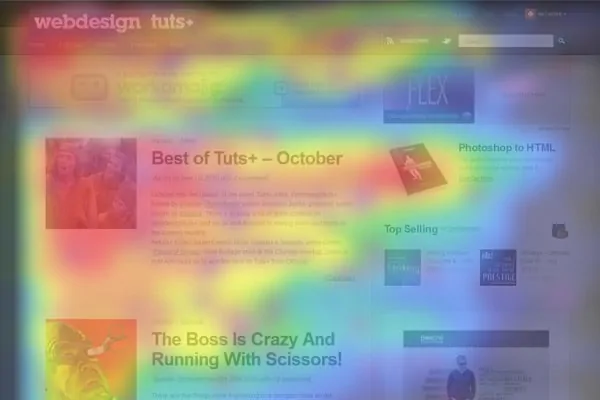
Visual hierarchy plays a vital role in sight reading, which is the mechanism by which the brain scans text to understand it.
Our brains don't literally read text like a machine, but instead "scan" it in order to understand the meaning. This scanning process is known as “ sight reading ” and involves the use of various cognitive mechanisms to process the visual information present on the page.
When we read, our eyes move rapidly through the words and sentences on the page, jumping rapidly from word to word. During this process, the brain tries to recognize the patterns and shapes of words, and to derive meaning from the surrounding context. Furthermore, our brain has the ability to “ fill in the gaps ” when reading, i.e. to automatically complete words that are missing or misspelled, based on the surrounding context and prior knowledge. This process is called “ fixation ”, and each fixation lasts only a few tens of milliseconds. After each fixation, the eyes move rapidly to the next area of interest on the page, in a process called a saccade .
In short, the majority of users who land on a page carry out a quick visual analysis of the content as their first action to understand if it responds correctly to the search for information .
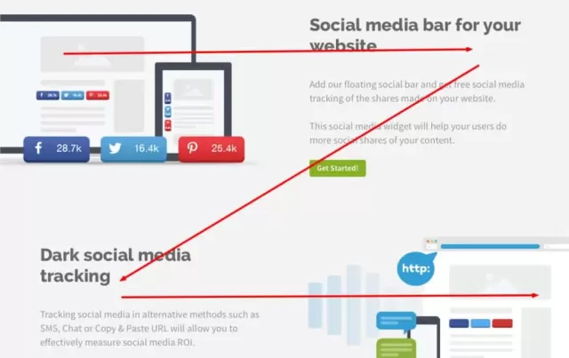
This type of analysis can typically be represented in two models : "F" and "Z".
Model "F"
“F” scan refers to a reading pattern where the reader starts reading from the top left of the page and scans horizontally across the top of the text, looking for the most important keywords and information. The reader then moves down one row and continues to scan horizontally, repeating this process until it reaches the bottom of the page. This form of scanning is often used for reading technical texts, such as manuals or reports.
Model "Z"
The "Z" scan is another reading mode where the reader starts reading from the top left of the page, horizontally scanning the top of the text as in the "F" scan. However, instead of scrolling down a line, the reader moves diagonally down and to the right to begin scanning the page in the middle, looking for key information. Next, the reader scans the bottom of the page, still horizontally, until it reaches the bottom of the page. This form of scanning is often used for reading advertising and marketing materials, such as brochures or ads.
Both forms of scanning are used to maximize text comprehension quickly and efficiently. However, it is important to note that scanning also depends on the specific text arrangement, paragraph length and font characteristics. In general, content and graphic designers try to create page layouts that suit how the reader scans, highlighting the most important information and using visuals such as headings, subheadings, and bullet points to make scanning easier.
Pro tip : In general, visual scanning occurs automatically and unconsciously, without us being aware of the process. However, you can improve your ability to scan text effectively through training and the use of targeted reading techniques, such as scanning for keywords and breaking text into smaller chunks of information.
Visual hierarchy involves using design elements such as the size, color, shape, and arrangement of visual elements to create a visual structure that guides the reader's eye through the design. This means that designers can use these techniques to highlight important focal points, such as headlines, subheadings and crucial information, so that the reader can scan through them quickly and effortlessly.
For example, a large headline at the top of a page naturally grabs the reader's eye. Next, smaller sized visual elements, such as subheadings or body text, can be arranged hierarchically to create a visual structure that guides the eye through the design in a logical and intuitive way.
In this way, visual hierarchy can help the reader scan a design efficiently and understand the content quickly and effectively, supporting our brain's scanning mechanism when reading.
How to create a visual hierarchy in design?
The key to effective design is creating a sense of order and structure. Hierarchy in design helps organize the elements of a project in a way that makes it easily understandable and navigable. It allows the designer to group related items and create a hierarchy of importance. The most important items should be placed at the top of the hierarchy, while the least important items should be placed at the bottom.
Hierarchy in design can be used to create a sense of balance and proportion in a project . By grouping related elements and creating a hierarchy of importance, the designer can easily create a design that is visually appealing and easy to understand. Hierarchy in design can also be used to create contrast and emphasis on certain design elements.
The designer must also consider the placement of elements in the design. Elements should be placed so as to direct the viewer's eye from one element to another in a logical order. Elements should also be placed to create a sense of movement and flow.
Also, the designer must consider the use of white space in the design. White space is an important element of design because it allows elements to breathe and creates a sense of balance and proportion.
White space or negative space
Just as proximity creates correlation, the "empty" space around items allows sets of information to be logically grouped by separating them from others.
Not only does it make content easier to read but it also helps increase attention span by allowing the eyes to focus more on well-separated individual elements.
What acts as a "surrounding" is just as important as the actual content.
White space has the task of guiding attention to certain elements: it makes information more immediate to perceive and allows the eye to focus on each individual block.
Try to leave plenty of space around particularly important elements: the more space, the easier it will be to understand.

Use hierarchy to create effective design
The key to effective design is creating a sense of order and structure. This can be done by grouping related items and creating a hierarchy of importance. The most important items should be placed at the top of the hierarchy, while the least important items should be placed at the bottom.
Additionally, the designer must consider the size, color, and contrast of design elements. This will help create a sense of balance and proportion. The designer must also consider the placement of elements in the design. Elements should be placed so as to direct the viewer's eye from one element to another in a logical order.
Types of visual hierarchy.
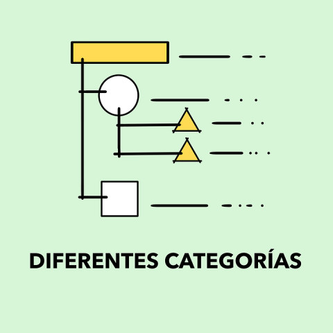
There are different types of visual hierarchy. The most common types are size, color, shape, contrast, alignment, and proximity.
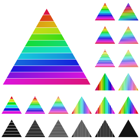
Size is visibility
Dimension is the most common type of visual hierarchy. By using dimensions, the designer can create a sense of importance and emphasis on certain elements of the design. The most important elements should be bigger and the less important ones smaller. it is necessary to understand the purpose of the communication that is being made to decide which elements are the most important. For example, for a flyer for a gathering or a party, the date and place should be the predominant elements, while for the sale of a product, the price will have greater importance in the hierarchical scale.
By using large images and larger fonts, you will be able to create clear hierarchical scales and to establish the correct relationship between the various objects involved in the composition.
Color excites
Color is another type of visual hierarchy. By using color, the designer can create a sense of contrast and emphasis on certain elements of the design. The most important elements must be of a different color from the less important ones but to give a sense of order the system of recalling the most important elements with the same color can be used.
Bright colors tend to draw more attention than less saturated hues.
In order, the eye falls more immediately on the bright colors, followed by the darker and richer ones, then the lighter and more faded shades and, finally, the grayscale colors.
Try to use softer colors for standard content and brighter colors to highlight priority information and important actions.
Be careful to maintain enough contrast to create a focal point.
Shape moves layout
Shape is another type of visual hierarchy. By using shape, the designer can create a sense of movement and flow in the design. here again the most important elements can be characterized so as to create a difference between the elements. moreover, for cultural reasons arrows, triangles or stars have interconnected meanings for us, for example we often associate the triangle with a signal of "attention" while the hexagon with a signal to stop and so on.

Contrast calls attention
Contrast is another type of visual hierarchy. By using contrast, the designer can create a sense of emphasis and importance on certain elements of the design. for example, it is common practice to use gray text instead of black for some parts of text that are not very relevant in communications.

Alignment and placement create balance
Alignment is another type of visual hierarchy. Using alignment, the designer can create a sense of balance and proportion in the design. deciding to right-align flag text over normal text will obviously affect both how you read it and when you read it; that is, such a text will always be read after what is on the left of the text is read.
In short, the placement of elements is another way to create emphasis. Within a block of text, we notice the headline first because it's the first in view, and then the paragraph.
In Western culture we are more used to perceiving things following our usual reading order (therefore from left to right). This makes the top-left objects on a page more attention-grabbing.
It is also important to try to maintain a balance between the various elements and between the elements and the space in which they are placed.
The same element placed at the bottom of a web page gives the impression of being heavier.
Proximity gives importance
Proximity is another type of visual hierarchy. Using proximity, the designer can create a sense of importance and emphasis on certain elements of the project. Proximity suggests the type of relationship between the various elements , it helps to create unity between the various elements by grouping them visually. The mutual proximity of the various elements inserted in the layout indicates that they are part of the same group, that they are related.
A smaller distance indicates that they are part of the same "context". Greater distance indicates they are not related.
This principle is especially useful for creating a visual hierarchy by arranging elements so that the more important ones are placed closer together than the less important ones. This can be done through the use of blank spaces or separations between elements.
For example, a designer might use proximity to create visual hierarchy in a website layout. The most important elements, such as the logo or the main navigation menu, could be positioned at the top of the page and close to each other, while the less important elements, such as secondary navigation links or contact information, they may be located further down the page.
In this way, proximity can be used to create a sense of importance and emphasis on key elements of the design, contributing to the creation of an effective visual hierarchy that guides the reader's eye through the design in a clear and intuitive way.
The perspective gives the idea of depth
By playing with shadows and dimensions it is possible for us to create a visual hierarchy based on an illusion of depth. Similar effects are part of the real world and of our daily lives, where we perceive larger objects as close and smaller objects as far away.
Larger objects within a layout attract attention more immediately than those considered more "distant".

Common mistakes to avoid when creating visual hierarchy.
Creating a visual hierarchy is an important element of design, but it can be easy to make mistakes. Here are some common mistakes to avoid when creating a visual hierarchy:
- Do not create a sense of order and structure
It's important to create a sense of order and structure when creating a visual hierarchy. Grouping related items and creating a hierarchy of importance will make your project easier to understand and navigate. when your brain has a doubt about which information to grasp first, it means that what you are looking at does not have a well-defined hierarchy. - Do not consider the size, color and contrast of the elements
It's important to consider the size, color, and contrast of the elements in your design. - Do not consider the placement of elements
It is important to consider the placement of elements in the design. photos, icons, logos, and blocks of text are all elements that need to be placed in a way that directs the viewer's eye from one element to another in a logical order. - Don't consider using white space
It's important to consider the use of white space in your design. White space is an important element of design because it allows elements to breathe and creates a sense of balance and proportion and this is often the greatest fear of beginning designers – the fear of white space. The "fear of white space" in graphic design refers to the tendency of designers to fill in the empty space in a design with additional elements, rather than leaving it empty or minimizing it. This fear may stem from a concern that white space may be seen as a lack of content or an incomplete design. However, white space, or negative space, can be a key element in creating visual hierarchy and good design organization. When used effectively, white space can help guide the reader's eye through the design, create a feeling of balance and harmony, and give emphasis to important content. For example, a designer might use white space to create a breathing area around an image or block of text, thus making those elements clearer and more distinct. At the same time, white space can help separate various design elements so they're easier to read and understand.
Blurring technique to test the effectiveness of visual hierarchy
An easy way to test the effectiveness of visual hierarchy is the Blur Technique , also known as the Blur Technique, proposed by designer Lee Munroe .
Although the name may recall Dragon Ball moves such as Sunstroke , this technique consists of blurring the layout to control which elements catch the eye and which do not. The Blur Technique is a sort of visual test that allows you to observe the layout without unnecessary distractions and which helps to evaluate whether the layout we have created is actually well designed.
To blur your page simply take a screenshot or export your graphic file and add a 5-10 px Gaussian blur with your favorite graphics program.

Conclusion
In conclusion, hierarchy in design is an important element in creating an effective design. By using hierarchy in design, designers can effectively communicate their message and create a visually pleasing design.
Creating a visual hierarchy is a process of organizing elements on a page or in a design to guide the viewer's eye and create a certain look and feel. As we've seen, there are many tools and techniques for creating visual hierarchy, such as size, color, shape, contrast, alignment, and proximity.
Creating a visual hierarchy is an important element of design and can be a challenging task. However, by avoiding common mistakes and following the tips in this article, you can create a visually pleasing design that effectively communicates your message, while avoiding creating a poorly managed hierarchy that can cause confusion and distract your audience.
Do you now understand what hierarchy is in design and why it is vital that you as a designer are able to master the various techniques? I hope this article has helped you understand the importance of visual hierarchy in design to make your graphic design easier to understand.
When you subscribe to the blog, we will send you an e-mail when there are new updates on the site so you wouldn't miss them.
About the author
By accepting you will be accessing a service provided by a third-party external to https://www.insightadv.it/


Comments