
How to make an effective infographic

What is an infographic? How are the best infographics made? Why make an infographic? When we need to offer statistical information in an immediate and clear way and at the same time we need to attract attention and arouse interest, infographics are the tool par excellence. Let's discover its potential.
What is an Infographic?
You've probably heard of infographics and seen many of them around. These could be ones created by the government to explain to citizens what to do, recommendations on hygiene and safety, or those used in a company to present impactful data.
Before we begin, let's try to answer this question: what exactly is an infographic? An infographic is a type of visual content that combines text and images to provide a thorough and immediately understandable explanation of a specific topic. In other words, it's a way of conveying information through graphic and visual elements.
Infographics can also include tables, diagrams, concept maps, diagrams, and signage systems that provide clear and precise guidance in various situations.
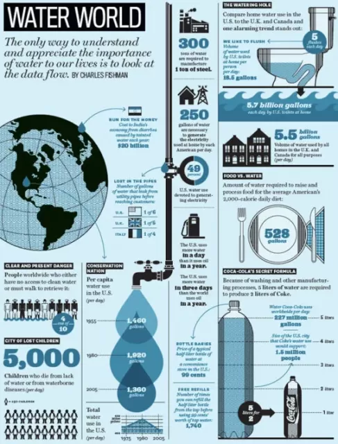 Water World. Illustration Francesco Franchi. Web font
What Do All These Data and Information Representations Have in Common?
The main characteristic of an infographic is synthesis. To be effective, it must present all the necessary information in a concise and easily understandable manner for the reader. Naturally, clarity and visual appeal are important, but the primary function of an infographic is to convey an overview immediately. For example, it can simplify a complex process, summarize key points, and much more.
Why Create an Infographic?
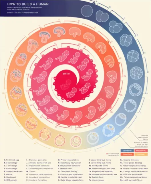 How do you build a human being? Author Eleanor Lutz for Tabletopwhale. The "main story" can then be divided into "paragraphs" without overall losing that sense of unity that involves us. In the example, a main flow (the spiral) is evident which acts as a common denominator for all the development phases of the embryo (paragraphs)
Why should we choose to represent content or information in the form of an infographic? How can we determine when it's appropriate to do so? Here are some advantages:
- Simple Communication:Infographics provide information instantly, whether they are intended for the general public or a small group of colleagues.
- Visual Impact: Infographics grab attention and are easy to spot among long texts or presentations.
- Aid in Memory Retention: The combination of text and images facilitates information retention for the reader.
Infographics can be created on any topic, for any type of audience, and for various purposes, including marketing. A well-crafted infographic with interesting content can even go viral when shared online.
What Does an Infographic Contain?
Now that we understand what an infographic is and its advantages, let's discuss what it should contain:
Numerical data must be contextualized to make sense. Without context, a numerical datum can be meaningless. For example, saying that Bangladesh had a population of 166 million in 2016 might not have much significance by itself. But when compared to Russia, which had a population of 144 million over an area 116 times larger, it becomes clearer. The use of visual analogies, illustrations, and graphs can help make these concepts understandable.
To represent data in an infographic, you can use three main approaches:
- Analogy: Find a visual way to express the key concept in a more impactful manner, both quantitatively and qualitatively.
- Captions: Present the key concept directly and linearly, accompanying numerical data with explanatory illustrations.
- Graphs: Use various types of graphs to quantitatively visualize the key concept.
5 Steps to Create an Effective Infographic
Here's a five-step guide to creating an effective infographic:
1. Define a Specific Objective
Avoid vague objectives like "synthesize" or "summarize." Instead, define clear and achievable objectives, such as summarizing the stages of a project or explaining the risks of a technology.
2. Identify Your Audience
Who will be the recipient of the infographic? This information will help you decide what information to include and what tone of voice to use.
3. Define the Key Point and Information Hierarchy
Gather all the data and organize it hierarchically based on importance. Choose keywords for titles and each point in the infographic.
4. Choose the Most Suitable Representation
Decide which type of graph or visual representation is most suitable for your data and create the infographic's structure. You can use bar charts, pie charts, timelines, or other forms depending on your needs.
5. Design the Layout and Appearance
Select dimensions, orientation, and arrangement for the layout. Choose readable colors and fonts and add graphic elements like icons and images to enhance visualization.
It may be useful to divide the process of producing an infographic into several phases:
- Collection and classification of information.
- Elaboration of a story, a unifying concept.
- Graphic elaboration of the main concept.
- Secondary graphic processing.
- Texts
- Layout.
The process can be very complex even if the final result is simple. The effort is rewarded by the effectiveness and multiple uses of communication of this kind:
- The best infographics on the web are linked creating popularity. Naturally they increase permanence on the website and create a concept of quality and improve the brand image.
- In traditional media they can be effective for conveying the brand and creating interest around an event or product.
- They can replace long-winded explanations or complicated operating diagrams.
- They manage to greatly enhance a technical article.
- They offer a clear summary useful for orientation and training.
- Archives of the best infographics arise spontaneously on the web.
As you can well see, the creation of infographics is not limited to the concept of working on a program to generate an image to share on blogs and social media: you have to think about the content.
In reality, this is precisely the most difficult part: you have to decide what to wear and what to avoid. Then there are different solutions to organize the graphics. What am I talking about? Tools for creating Infographics.
Tools for Creating Infographics
You can create an infographic using professional graphic design software like Photoshop or Illustrator. However, there are also free and paid online tools that simplify the process. Some examples include:
- Canva
- Venngage
- Infogram
- Piktochart
You can also consider more advanced options like Visual.ly, Easel.ly, or Tableau.com. Additionally, animated infographics or video infographics can add an extra layer of dynamism to your communication.
Now that you have this information, you're ready to create effective infographics to communicate data and information clearly and engagingly. Good luck!
When you subscribe to the blog, we will send you an e-mail when there are new updates on the site so you wouldn't miss them.
About the author
By accepting you will be accessing a service provided by a third-party external to https://www.insightadv.it/


Comments