
The fundamental graphic signs: what they mean and how to use them

Maybe you've been working in the sector for a while, or you've already seen many graphic projects and read many things about graphic design , but do you know what the fundamental signs are ?
We can say that the fundamental signs are to a certain extent the basis of graphics , because they are the elementary forms from which all the others derive. Their importance lies not only in the fact that they are the abc of the graphic designer's work, but also in their meaning .
Semiotics , which is the science that deals with studying the meaning of signs, teaches us that we tend to associate a meaning, an idea, a message with every shape .
How we perceive these shapes is also important. For example when we talk about gestalt or the golden section or optical corrections.
So if you know the meaning of the basic graphic signs you can use them to make your project more convincing and effective.
So let's go immediately to see what they are, what they mean and how you can best use the fundamental graphic signs.
The fundamental graphic signs: what they are
There are five basic signs:
- square
- circle
- triangle
- arrow
- cross
The first three are filled forms, while the last two are not.
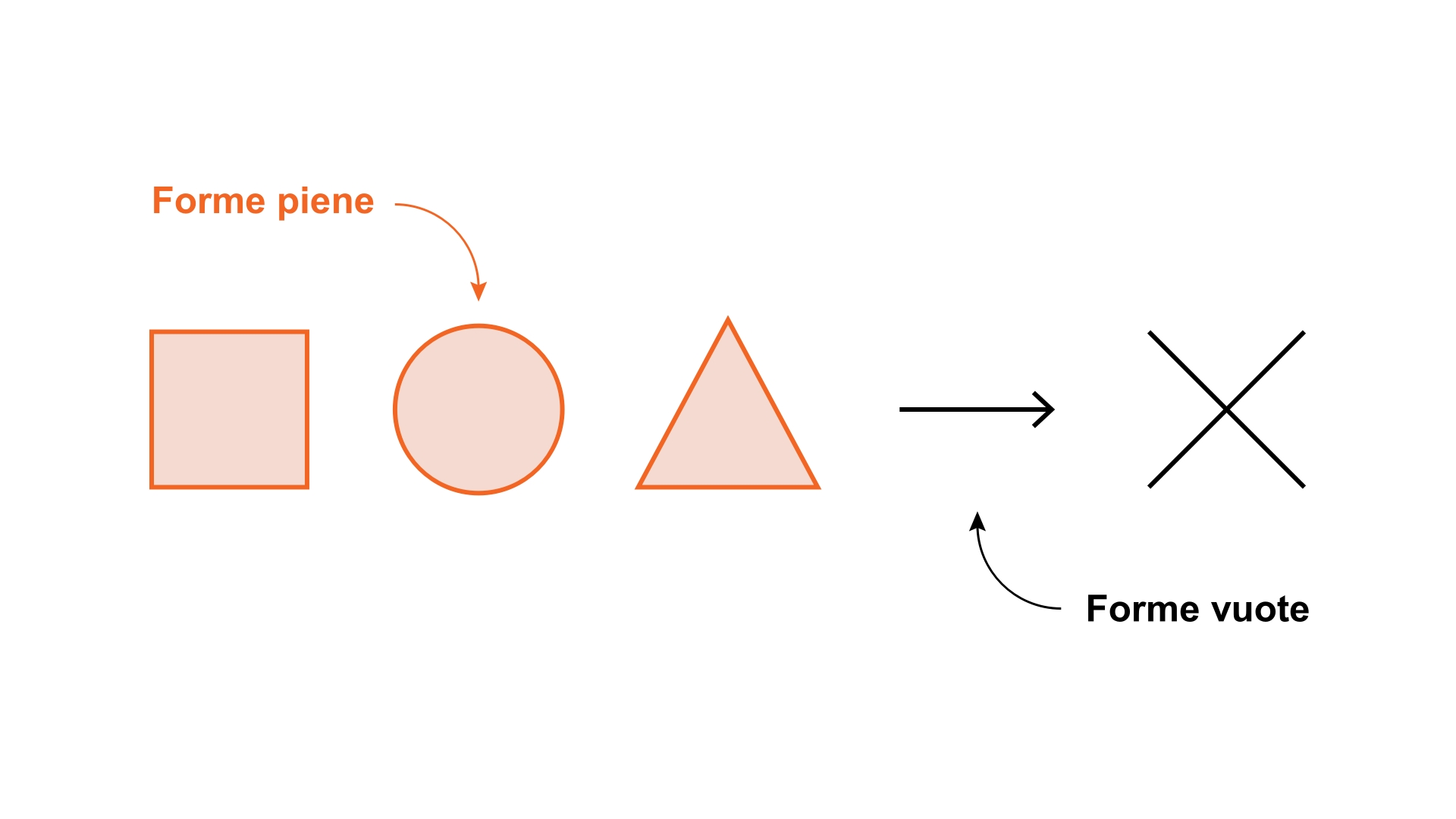
This implies a big difference, in the way we perceive them and therefore, consequently, in what we see ourselves.
For this we are going to deepen the meaning and use of all five.
The square
The square is made up of straight lines that meet at a 90 degree angle .
This uniformity and proportion mean that the square between the fundamental graphic signs has always been the one linked to the concept of stability.
What does it mean
The idea of stability therefore translates, figuratively, into the idea of authority, reliability and security that this shape communicates. We've always known this: even Dante said he was "well tetragonal to strokes of luck", using the reference to the cube as a synonym for "firm, firm, immobile".
How to use
These meanings that we tend to attribute to the square are valid in any context. We can therefore use the square in different areas of graphic design
Layout
In a page layout the square shape, attributed for example to a block of text , serves to obtain an effect of great balance and harmony. It can be useful to combine several blocks to which we want to give the same importance.
digital interfaces
Using the square, or rather a derived shape such as the rectangle, for the UI elements of a site can be useful precisely to create a sense of trust and convey authority.
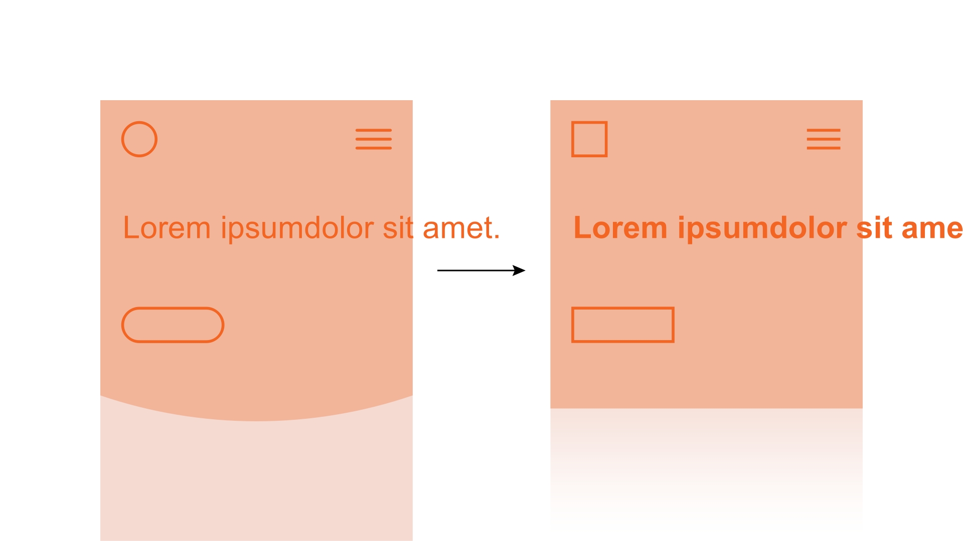
It is therefore to be recommended when we assume that the user has reservations or doubts regarding the interaction we suggest.
Photos
If I say “square photographs” what do you think about? Instagram , I bet!
In fact, the success of this format for a social channel is precisely linked to the characteristics of this form. Which is by no means new: think that already in the 1920s there were cameras that took square photos.
But so why this format works so well? Because it's easy! In fact, in a square format, it is easier to highlight what we want to enhance, without having to puzzle over the composition too much.
A beautiful subject, in the center of a square, will certainly have a great effect!
Font
In typography you can choose square-shaped characters whenever you want to arouse trust, communicate authority.
Famous examples
There are many very famous logos that use the square as a fundamental sign: for example American Express and Axa . Here the intention to give the customer a sense of security and to present themselves as stable and authoritative companies is evident.
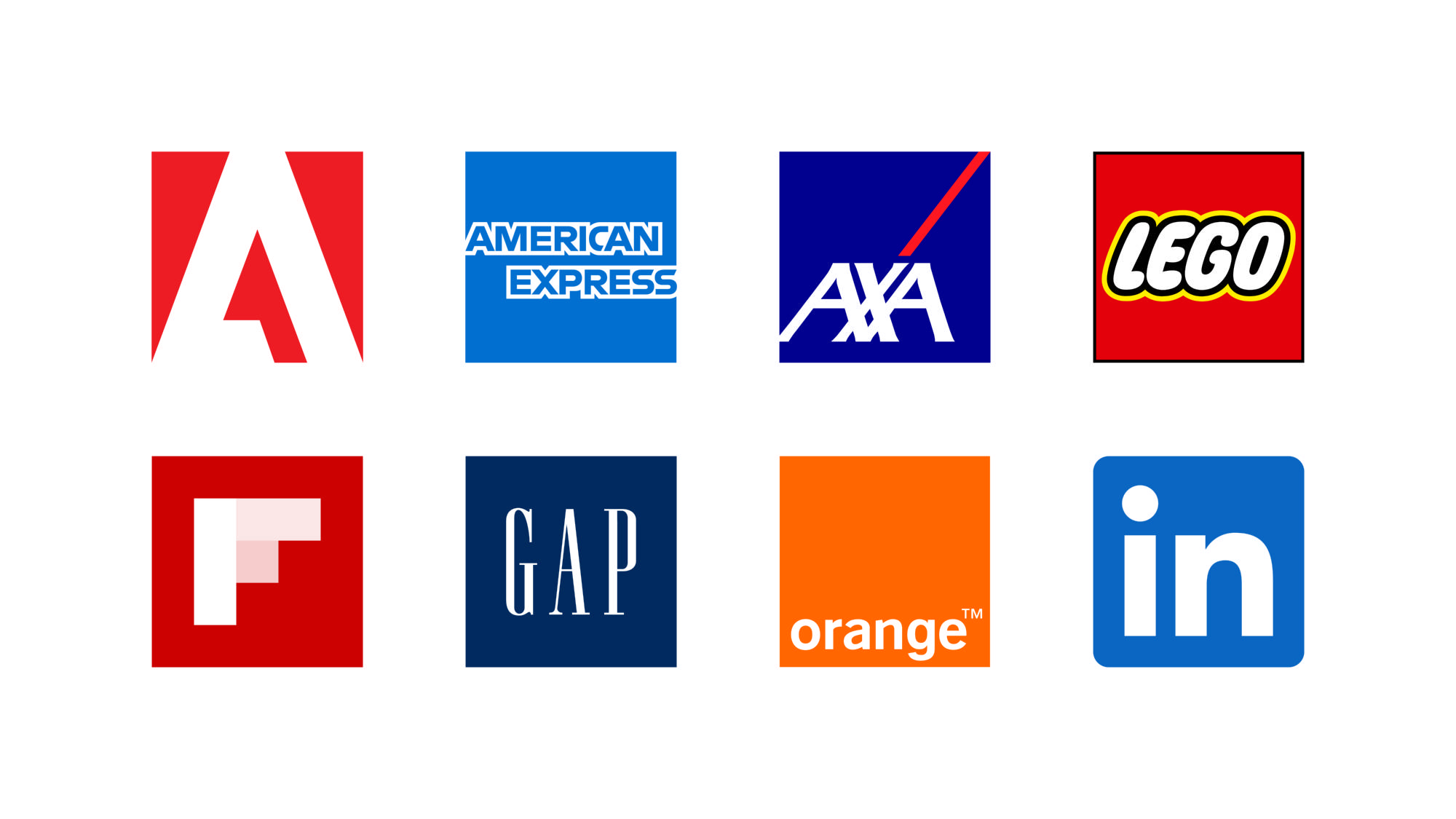
Can you think of another logo all played on squares? Of course, Windows ! Also in this case the aim is for an audience that needs to be reassured, and also in this case the choice of the square sign places the company in a precise position with respect to the main competitor, which relies entirely on audacity.
A couple more considerations. Better not to overuse the square shape: it can create a sense of excessive rigidity and uniformity.
What if you want to make the square more dynamic instead? Easy, just rotate it 45° and place it on the vertex!
Triangle
Bruno Munari on the first page of the book published in 1976 and dedicated to the triangle writes:
«While a right triangle can have different sides and therefore different shapes, the equilateral triangle is by itself, immobile in its structure of three equal sides and three equal angles, the most stable shape»
What does it mean
In fact, the triangular shape has this characteristic: it expresses different concepts depending on the orientation . It can indicate direction and dynamism, as well as stability.
How to use
When we talk about digital interfaces, the triangle with the base on the right or left is interpreted as an arrow. This is why it is associated with the playback buttons for audio and video files
With this function we find the triangle inserted in logos that you are sure to see every day: those of Youtube and Google Play.
Graphic projects
Within articulated graphic projects , such as a visual identity of a brand could be, the use of triangular shapes, especially those with a vertical base, can be very useful if you want to represent speed, action understood as movement.
Want a really cool example? Nike Track+Field identity designed by studio.Build.
Layout
If, on the other hand, you deal with layout products such as posters or billboards , remember that the triangle , as well as movement, can also indicate change .
It therefore introduces a very strong idea of dynamism , even more accentuated if the figure is resting on a vertex, with the base up.
Famous examples
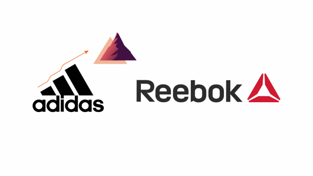
Several brand logos that you certainly know very well have chosen the triangle as a basic figure among the fundamental graphic signs .
However, the majority chooses to have the base rest horizontally at the bottom . Arranged in this way, the triangle strongly recalls the mountain .
So stability and durability , but also resistance and the ability to achieve ambitious goals .
This is why it is much loved by sporting goods brands , such as Adidas and Reebook, or by companies operating in the extreme sports sector.
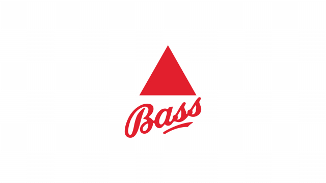
A curiosity : the first registered trademark ever issued by the British government, in 1876, is indeed a triangle . In particular the red triangle that still today identifies the Bass brewery .
Circle
Adrien Frutiger in his Signs and Symbols wrote:
In the circle, the observer encounters the line of eternal recurrence, which neither begins nor ends and revolves around an invisible but well-defined centre. Similar to the idea of the course of time, which comes from nowhere and has no end.
What does it mean
Among the fundamental graphic signs, the circle is the one that is most easily associated with the concept of beauty and perfection .
It is also a very versatile sign, which can take on different meanings depending on context and experience.
How to use
Precisely because it is a sign in which we see infinite meanings you can use it to obtain very different effects, let's see how
Layout
In a layout, circular shapes give a less rigid and formal appearance especially when compared with other fundamental graphic signs such as the square or the triangle.
digital interfaces
As far as UI elements and digital interfaces in general are concerned, you can effectively use circles and circular shapes if what you want users to perceive is the simplicity of the product or service in question.
Illustration and logos
Unlike the square, which conveys stability, the circle lends itself very well to communicating the passage of time , dynamism and movement . In the latter case, especially if you use a derived shape, such as an ellipse, and place it at an angle.
Famous examples
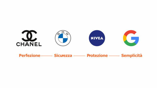
The brands that have chosen the circle among the fundamental graphic signs for their image are really, really many. But I want to mention some of them to you because they give you a good idea of how versatile this shape is.
If the two crossed "cs" of Chanel are certainly a reference to aesthetic perfection , and the same thing can be said of BMW, when we talk about Nivea we certainly think of protection in that case.
In the digital sphere, then, we certainly cannot forget Big G! If Windows focuses on a reassuring square , Google's G is round to communicate ease of use and a decidedly less formal style.
Also (actually above all) in the case of the circle, pay attention to the context : if on the one hand it can communicate protection and inclusion on the other it can communicate isolation.
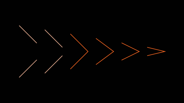
The arrow
With the arrow we introduce the first of the two fundamental graphic signs not to be a closed form .
When two oblique lines meet to form an angle, an image of movement or direction is somehow produced.
Adrien Frutiger, Signs and Symbols
So two lines are enough to summon an arrow. Furthermore, the more acute the angle of the arrow, the faster the perceived movement seems to us
What does it mean
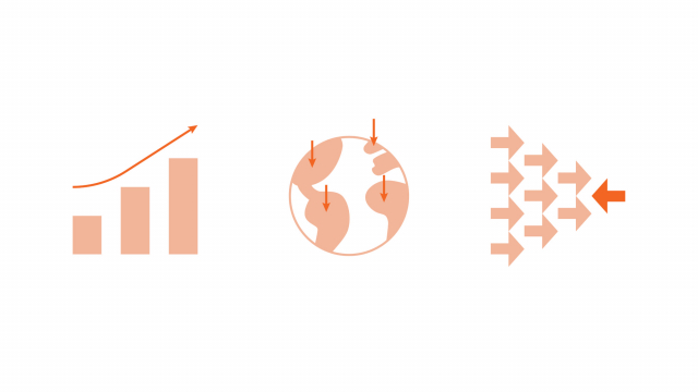
For these reasons, among the fundamental graphic signs, the arrow is certainly the one that suggests direction, dynamism and movement more than the others.
But precisely because we associate it with an object with a very specific purpose, the arrow can also suggest other concepts, such as alarm or aggression .
How to use
In the vast majority of cases the arrow, especially if drawn with a horizontal shaft, indicates direction.
Web interfaces
In all user interface elements, and in design elements in general, the arrow has the function of
- guide the eye
- highlight a move
- highlight an action.
Do you know Google Translate ? In designing the interface, for example, it was decided to use two arrows in opposite directions to identify the switch between the language of the text and that of the desired translation .
Graphic elements
The arrow, we have seen, has a very strong meaning.
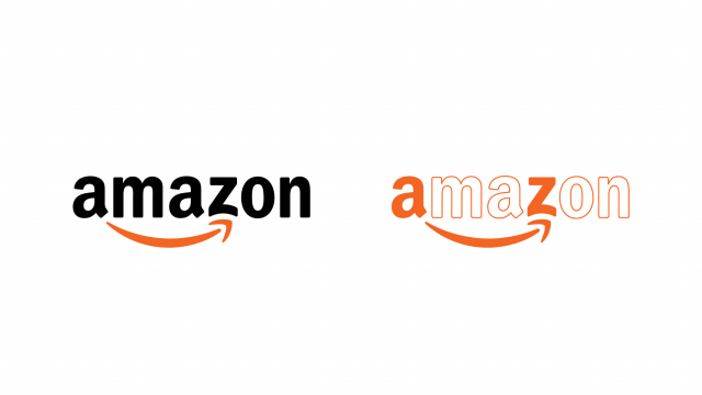
If you are working on a project and want to insert a dynamic sign of action, but without evoking alarm , then you can choose to curve the arrow to give a sense of greater serenity. Almost a smile…
Exact!!! you certainly did not miss my reference.
The Amazon logo is a perfect example of this use of the arrow . In addition to representing direction as a central symbol of the service provided by the brand, the sign softens and curves to suggest a small smile.
Also pay attention to orientation : while an arrow pointing upwards can help you whenever you want to convey the idea of growth and success, the one pointing downwards can indicate negativity but also static, position.
Finally, an arrow pointing to the left, since we read and layout from left to right, can mean stop or return.
Famous examples
Well, perhaps the most famous one I have already mentioned to you before.
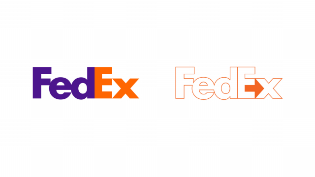
The FedEx logo is very curious : here too we are talking about shipments . In the case of this brand, however, the arrow is inserted in a more discreet way . It is formed by the negative space between the letters E and X . Did you ever notice?
Another arrow that you should have noticed, perhaps somewhere on your laptop, is that of AMD , the brand best known for processors. In this case a "massive" but positive arrow combines the meanings of speed, dynamism, success, without renouncing a reassuring solidity
As we have already mentioned, pay attention to the arrows: if you don't want to arouse alarm or evoke aggression, try to soften the shape
The cross
The cross could be called the sign of signs. The crossing point between two lines has something abstract and invisible but so defined that it has always been used constantly to indicate the exact position of a point
Adrien Frutiger, Signs and Symbols
The cross is, in fact, a meeting between two lines , which however does not take place at the vertex, as instead happens for the arrow. Depending on how the sign is rotated, the point where the two lines meet and the angles they form, both the appearance and the meaning change profoundly.
What does it mean
In reality the cross, a bit like all fundamental graphic signs, brings with it a world of interpretations and meanings . We could talk about the cross as a religious symbol or as a symbol of heraldry or show examples of dozens, hundreds of logos, icons and/or illustrations.
As far as graphic design is concerned, we can identify two broad categories of meanings.
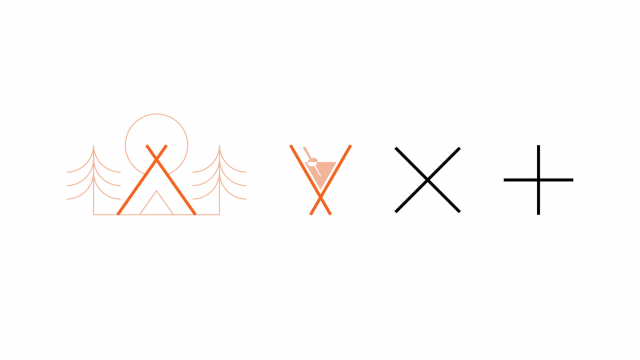
When the angles are not right and the crossing occurs not halfway along the lines, the cross usually takes on a more concrete meaning. Indeed, it can suggest a barrier, a human figure with raised arms or even a glass.
When instead the intersection occurs at right angles we can have, depending on the rotation, an X figure or a + . In these cases the meaning is usually a prohibition / error for the X, while for the + the meaning is the mathematical one.
How to use
Among the fundamental graphic signs, the cross is perhaps one of those that has the greatest strength, one might say the greatest weight.
If on the one hand it is very effective, on the other hand it is necessary to use it with balance and try to dampen its protagonism in some way … unless that is exactly what you are looking for!
Web interfaces
In digital interactions the cross is very frequent: it is the sign that tells us to close something , usually a window, but also the one that signals an error .
Precisely because we are so used to using it for these purposes, it is good to try to limit an overly creative use of this sign, so as not to create confusion.
Layout
The cross is a shape that lends itself very easily to modularity . It can therefore be used as a basis for creating interesting patterns.
Since it can also mean "crossroads" in the sense of "meeting", this fundamental sign can be used effectively whenever we want to represent the idea of a meeting between people or between concepts.
Famous examples
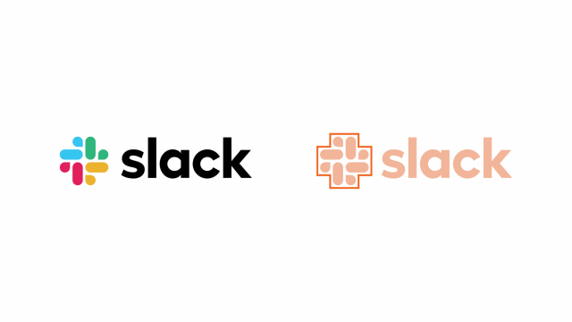
We have mentioned that the cross is a sign used to symbolize meeting: precisely with this value the cross is the graphic sign at the base of the Slack logo . Among other things, the brand image of Slack has always been one of the most interesting and somewhat discussed.
And for streaming ? Obviously Disney plus , which chooses the cross vertically, to form the mathematical symbol of the "+". This use is very common for all those brands that want to maintain an image that has a story, a value in itself, but at the same time signal the presence of a service or an additional offer.
When you subscribe to the blog, we will send you an e-mail when there are new updates on the site so you wouldn't miss them.
About the author
By accepting you will be accessing a service provided by a third-party external to https://www.insightadv.it/


Comments