
The Brand Identity of a product, service, organization or company represents the essence and values that the latter wants to convey to its customers. It must inspire confidence and superiority over others and must make the company unique. Today we will see how important the choice of color is for your Brand Identity .
What is Color Psychology?
Knowing the psychology of color is essential for building your own Brand Identity and everything concerning the "graphic design" of your business, such as logo, website and online store (eCommerce).
In short, color is a sensation that is received by our brain and that causes certain feelings and emotions, our relationship with colors depends on the way we perceive external colors and on which emotional concepts we unconsciously associate with them, both on the basis of our personal experience, both on the basis of the cultural context in which we live which influences us more or less directly.
Generally speaking, warm colors (yellow, orange, red) are stimulating and positive, but also impetuous and decisive. Soft colors such as pastel shades and cool colors such as green and blue are reassuring and inspire confidence.
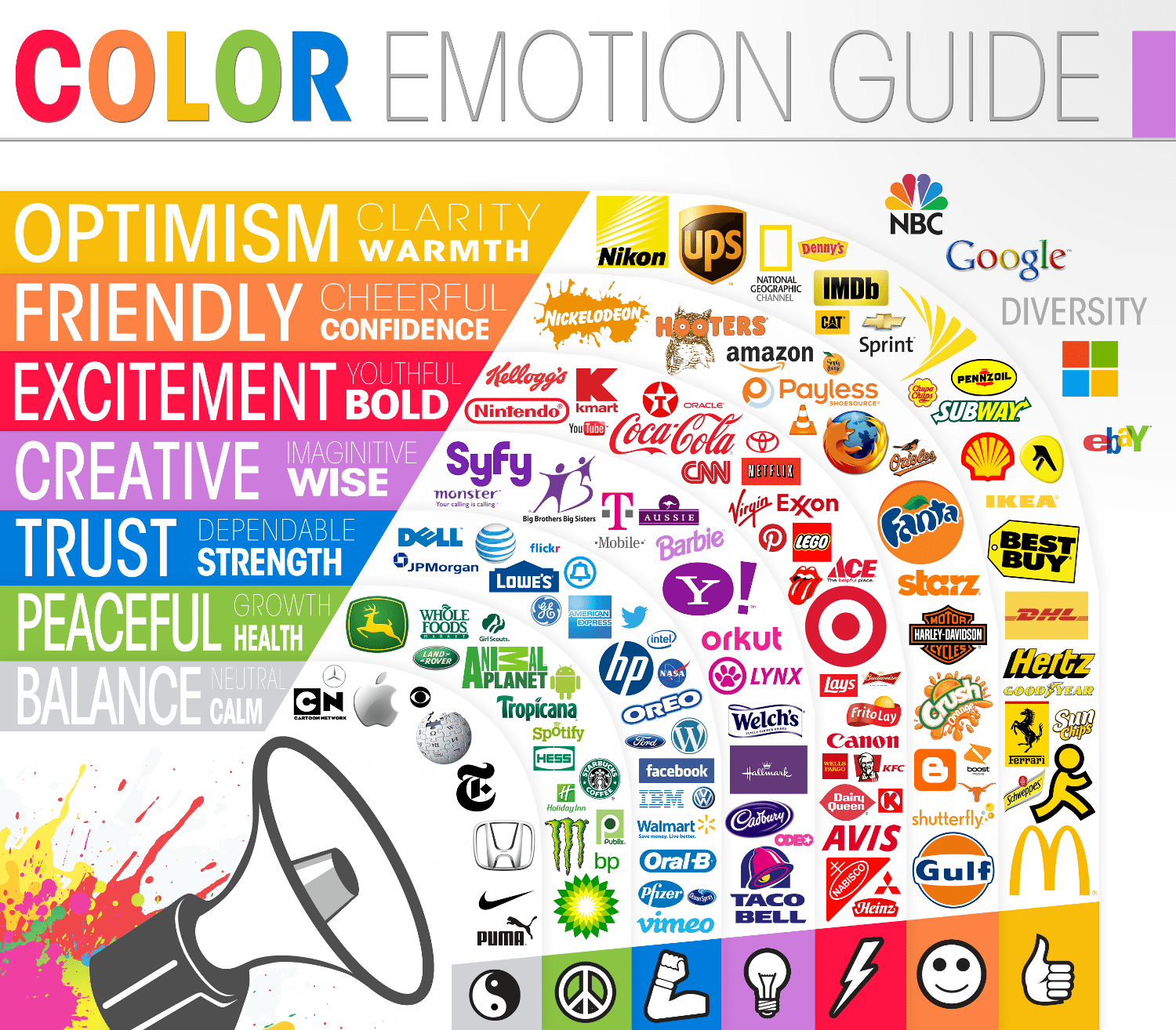
This is why choosing a color is essential. If you analyze the different corporate brands in the world by dividing them by the predominant color of the logo, you will notice a lot of things in common between them.
Red

Red is the most vibrant and stimulating color: it expresses many positive feelings, love, passion and emotion. It is the first color we notice, and it is the color that most of all is capable of attracting our attention and provoking any emotional reaction in us; it is the color of audacity, of grit, and stimulates a sense of urgency and immediacy. It is used especially in the food industry because, in practice, it whets the appetite, it is no coincidence that it is the corporate color of brands such as Coca-Cola, Barilla but also of products such as Kinder and Nutella by Ferrero.
It is therefore a very dynamic color, with a decidedly strong potential. But, for this very reason, it can prove to be a double-edged sword.
In fact, red is also the color of danger, and is often associated with unpleasant situations (red like blood, an emergency signal, debt). Tires the eyes, causes insomnia, increases blood circulation: a color to be used with moderation and awareness.
Yellow
Yellow is the "cheeriest" color of the color wheel: it is the color of the sun, of joy, of optimism. It has many of the intrinsic potentials of red, but without its side effects: it attracts attention, creates energy and expresses positive and reassuring sensations. Studies show that black lettering on a yellow background is the easiest color combination to read and remember. In general, the contrast between black and yellow is really very effective, both from a purely aesthetic point of view and from a communicative one.
Yellow represents a stimulus to action and mental activity, promotes communication and symbolizes optimism, positivity and growth. For these reasons it is used by companies, especially in the technology or dissemination sector that want to transmit dynamism such as Nikon or communication such as National Geographic. Since it is the color we associate with the sun and therefore with the source of life and heat, it is an excellent color for representing happiness and vitality but at the same time for transmitting energy. It is therefore no coincidence that companies such as Shell, Eni, Q8, Agip and IP have yellow in their brands.
Orange
If yellow represents a stimulus to mental activity and thought and red to physically act in reality, orange is an equal union of these two characteristics that lead it to be unique and different from its "parents".
Orange is a very lively, dynamic and welcoming colour, being a warm colour, it is excellent for easily attracting attention and giving a graphic composition a strong emotional value.
It is absolutely the color of creativity, confidence and mental energy. It is used for logos and brands of energy drinks, hi-tech or consultancy companies, gyms, leisure centers and is also widely used in the food industry sector because, like red, it strongly stimulates appetite and the need for physical consumption.
Blue
Statistics say that at least 42% of people in the world say that blue (in all its shades) is their favorite color. The obvious consequence is that blue is the most used color in the production of logos and graphic elements.
In fact, blue arouses an incredible amount of emotions in man. Just think of the sense of peace and relaxation in looking at the sky or of calm and at the same time adventure in looking at the sea when it is calm. In some ways it can be considered as the opposite of red, especially from the point of view of the emotional set. Where red represents impulsiveness, blue instead enhances reflexivity and thoughtful thought. Inspires confidence and calm, reduces stress and predisposes to a positive attitude and loyalty.
The characteristics of relaxation and friendly spirit make it perfect for companies that focus on interaction such as Twitter, Skype, Facebook, Flickr, Linkedin and Vimeo. Blue transmits security, trust and reliability, these characteristics always make it the first choice for logos of institutions such as the Police and Carabinieri, of political parties but also of banking and insurance institutions or financial companies. Blue is also an excellent color for those who offer marketing services. Among the companies that use it we can mention Paypal, Dell, WordPress, Intel and Facebook.
Viola
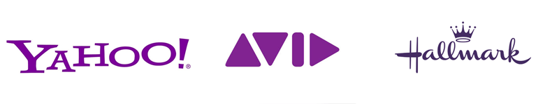
Purple is the result of the combination of the passion of red and the reliability of blue, making it a very versatile color that can be used in different business models. Purple conveys creativity, but also luxury and wisdom, and is also one of women's favorite colors. A purple colored logo immediately conveys very spiritual and inner sensations. The richness of this color is closely linked to its royalty and spiritual depth.
It is a color of elegance and is used by companies in the high fashion, perfume and personal care industries, but also in finance, marketing and the web (see Yahoo!)
Rose
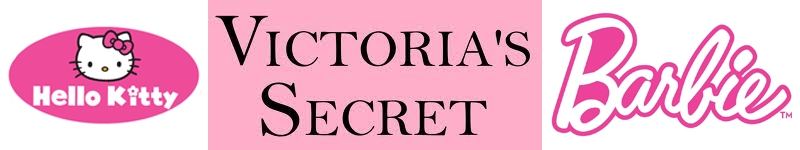
Pink is the color that represents femininity, delicacy and even romance.
However, its strong point is also its weak point, namely the almost stereotyped association between the color pink, women and the female world in general. In fact, it is a color to be used with great caution, because it is not necessarily the best color to communicate a product to the female world: numerous statistics state that women's favorite color is blue, followed at a good distance by purple.
However, it can be a very valid color, for example for graphics or products dedicated to early childhood or the children's games sector.
Green

It has many characteristics in common with blue, such as transmitting relaxation and tranquility, as well as positive and reassuring sensations.
It is by definition the color of nature and therefore of everything that is ecological, that is bio, that does not pollute, that is precisely "green". In addition to being the color of nature, it is certainly the color of life and therefore it is suitable for all those logos and graphic projects that want to convey liveliness in a relaxed and natural way.
For example, green are the logos of many technological products such as Android, X-Box, Whatsapp, Acer which use this color to convey the desire to grow and enterprising. Different shades of green express different feelings.
A dark green, or even an olive green, like blue, conveys a deep sense of trust and safety and is in fact used for numerous banking or insurance institutions and, in some countries, even as the social color of the police.
A green that is too bright, tending towards yellow, is considered visually annoying: it is better to use a less lively shade, which denotes stability, growth and wealth (let's not forget that green is the color of money and economic well-being).
Brown

Brown is a warm, comforting warmth often associated with earth and nature. In the lighter shades, tending towards beige, it expresses a feeling of comfort, and is particularly suitable for giving a luminous nuance to a graphic composition. In the darker shade it expresses simplicity and roughness by tracing the neutral color of the wood and the earth.
The perfect color for all that is rustic and for all industries related to wood, coffee and chocolate.
It is however a very elegant colour, especially if combined with a special tint, such as gold: it is not difficult to find similar shades in sophisticated and glamorous graphic projects. But be careful because in certain situations it can give a negative effect of dirt and neglect. It is also a very masculine color and therefore not very suitable for a product intended for female consumption.
Grey
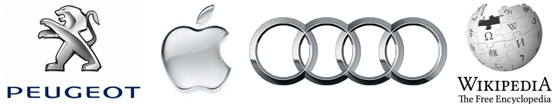
The neutral color by definition. It expresses solidity, durability and resistance, all characteristics associated with metal. The same nuances and textures of silver and steel are very suitable, for example, for the entire technological and IT sector such as the Apple apple or the Wikipedia logo. Formal and dignified, it expresses detachment and solemnity. As elegant as black and white, but decidedly more neutral than the latter, it is the perfect color to show seriousness and composure in a non-aggressive way.
It finds very wide applications in the world of the automotive industry with Nissan, Peugeot, Audi, Toyota, Opel and many others but also in fashion and in all those companies that want to convey the characteristics listed above in a non-aggressive, refined and elegant way. Despite being one of the most popular colors in logo graphics, it is also one of the least loved by people and should therefore be used with great attention to your target audience.
White
White is the color of purity, innocence and chastity. It is a decidedly impersonal color, yet capable of conveying a profound elegance. It is used to represent the concepts of order and cleanliness (if we think of white sheets or a doctor's coat, the unconscious combination with an aseptic and immaculate environment is immediate) and to give an essential and sophisticated cut to a graphic project. It is suitable for everything that wants to be minimalist and pure with an aesthetic potential for elegance that tends practically to infinity.
Also, one should never forget how important white space is in graphics.
In our culture white is immediately associated with the religious world, especially with marriage. It is therefore largely usable if you want to build a logo for a bridal shop; it's also a must-have on many photo sites, because thanks to the neutral color in the background, the images appear more vivid and become the focal point of the page.
Black
Black, like white, can be combined with any color but especially those with strong colors or very light shades. The pairing par excellence that will surely never fade is the one between black and white, symbol of elegance and purity of forms par excellence. Black is a very heavy color (for example, reading on a black background tires the eyes a lot), and it conveys a very risky range of emotions: it is the color usually associated with death and mourning, it is the color of darkness, of night and of evil. Despite this, it still remains the color of elegance and therefore can be very suitable (for example combined with white, gold or silver) for products and brands related to the fashion, perfume or art and design industries.
Now you know the importance of the choice of color for a logo, so you designer remember that without a good basic knowledge you risk not being professional and not being able to justify your choices in a sensible way, while you customer, that innovation without functionality in this field above all, it's a bit like throwing money and time out the window.
The best color combinations for company logos
As you've come to realize so far, selecting the best logo colors isn't about choosing the colors that look the best or the logo colors that you like. Rather, you need to consider the significance of color in logo design, strategically evaluate the impact of the colors you choose on your target audience, and select company logo colors they will respond to positively.
Of course, there are an infinite number of color combinations that can be used in logo design, but some are better than others. So to help you find the best logo color schemes, we've put together a collection of the best corporate logo color schemes used by major global companies and corresponding examples to show you how you can borrow them to create your own logo color scheme. the logo:
1. Monochrome logo color schemes
Monochrome logo color schemes use only one hue, but can use various shades, tones, and tints of that hue to create the perfect logo. This approach to logo colors is among the most popular of the color schemes, because it's the cleanest and easiest to work with. Here are four color scheme approaches for monochrome logos.
PayPal is a good example of a company successfully using monochrome colors for their corporate logo. Their text logo combines both a shade of blue and a tint of blue to create the logo colors, which means we're stable and reliable. These colors can be transposed to a variety of businesses. This is a great example of how they can look on another type of logo.
![]()
Now let's move on to some brands that are in the gray area of monochromatic color schemes. Nike, for example, might be considering using a monochromatic color scheme, as the company's simple swoosh is usually black on white. However, it can also be white depending on the background it is being shown against.
This is something Apple does too. Even though these two colors are opposites, both companies have used them interchangeably as logo colors signifying sophistication and simplicity. If you're interested in seeing how the simplicity and elegance both companies bring to their logos can translate to other logos, check out this other example.
Like Nike and Apple, Coca-Cola falls into a gray area of monochromatic color schemes. Quite often their famous text logo is white on a red background, but sometimes the logo itself is red instead of white.
While the red color symbolizes passion and vitality and is meant to activate hunger, the white color represents the elegance of the Coca-Cola brand. To see how this color scheme translates to another logo, take a look at this example.
![]()
While the advice for a company looking to create a logo is to pick one logo and stick with it, one of the things that was interesting about many of the companies on this list is that the logo they started with is often very different from the logo they use now.
The Starbucks logo is no exception. The color of the Starbucks corporate logo went through four changes to arrive at the current minimalistic and monochromatic color scheme with a circular green stencil which, when placed on the white glasses, displays the mermaid graphic. This logo, for example, is inspired by the Starbucks logo.
![]()
2. Similar color schemes for logos
An analogous logo color scheme uses colors that are next to each other on the color wheel. These color combinations are usually harmonious and pleasing to the eye.
One of the Big Four global professional services firms, PwC rebranded in 2010 with a logo that sets them apart from the pack and is easily one of the best logo color combinations of any major company.
By eschewing blue, a favorite of large consultancies, banks and financial firms, and choosing an eye-catching array of reds, pinks, yellows and oranges for company logo colors, PwC established itself as innovative and bold as well as energetic , friendly, sociable and passionate.
It's a good lesson for any business: if you want to stand out, be different. If you are interested in bringing the same qualities to your logo, this is a good example of how you can apply the same color schemes to your logo.
![]()
BP is another company that uses a similar color scheme for the logo. Its logo uses greens and yellows to create a sun and calls to mind nature, health, optimism and balance. This is a great example of how this color scheme should work for many other businesses.
![]()
3. Complementary color schemes for logos
Complementary colors are opposite each other on the color wheel. The high contrast of complementary colors creates a vibrant look that can be a bit much, but there are some companies that have used them and used them well.
Firefox is one of those companies. Who doesn't know their combo of blue and orange, which are good colors that signify intelligence, reliability and stability coupled with enthusiasm and excitement? If you think these complementary colors would be good logo colors for your company, then take a look at this example to see how you could use them.
![]()
While Firefox uses a simple complementary match, FedEX takes a slightly different approach and in doing so has created one of the best logo color combinations and certainly one of the most popular. Instead of pairing orange with blue, they use a purplish-blue tertiary which fortunately is close enough to blue to work very well. If you think you are inspired by the FedEx logo this example may inspire you.
![]()
4. Tetradic logo color schemes
The tetradic color scheme, also known as the double complementary scheme, is one of the richest of all color schemes as it uses two pairs of complementary colors. The Microsoft logo is a great example of how to do it right, and if you want to make your logo with dual complementary colors, this is one example.
![]()
5. Triadic logo color schemes
Logo triadic color schemes have three equally spaced colors around the color wheel. The easiest way to identify them is by using an equal-sided triangle and pointing to the primary color of your choice on the color wheel. The other two dots will be on the corresponding colors of the triad.
Burger King uses one of the best-known triadic logo color schemes, and if you're looking for an equally vibrant combination, check out this example.
![]()


Comments