
Kerning or kerning, what it is and how it is used in graphics and typography
In graphics , managing space well is essential and this also applies to font space : we have already talked about the vertical space between lines of text, ie the line spacing , but now let's deal with the horizontal one and the parameters called kerning and tracking .
It can happen, indeed it happens very often, that a text element inside a graphic, or the logotype or even the pay off of a logo, doesn't convince us much.
Usually, at this point, it is natural to blame this annoying sensation on the chosen font . Of course, choosing a quality font is an excellent starting point (if you need help, I'll explain how to do it here ).
But beware! The space that separates and distributes characters can have a decisive impact. That's why I'll explain immediately what kerning is , one of the parameters of the horizontal spacing of fonts, and how to use it really well!
What is kerning
First of all, the word kerning in Italian corresponds to kerning. It is basically the process of managing the space between two individual letters of a font .
Kerning is one of those parameters that are defined in the process of creating a font . If used correctly, it makes the composition more harmonious and easier to read.
It is an element that cannot be managed through an automatism. In fact, even when a font uses a homogeneous measure for kerning , there are letters that side by side create an unpleasant optical effect, if that distance is kept fixed.
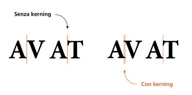
Letters such as A and V, or A and T, if placed side by side in a mechanical way , with homogeneous spacing, appear to us as "too distant". This is one of the classic cases in which it is necessary to intervene by modulating the kerning correctly
Font kerning and perception
Correctly managing kerning is a process that consists mainly of a visual exercise , not a mathematical one. The space on which we are going to act, in fact, is not a space of mathematical regularity, but rather a perceived space .
Indeed, an example of kerning that produces a bad reading comes to us precisely from those contexts in which kerning is fixed .
This happened, for example, in typewriters : their particular technology, in fact, meant that the size of the letters and the space between the different characters was fixed.
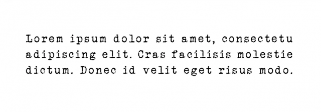
The result was very tiring texts , which could be read with some difficulty precisely because of the inharmonious effect of kerning.
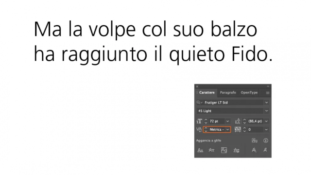
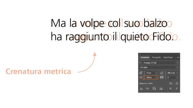
Kerning types: Metric kerning
These two types are the ones you can change when you use graphics software capable of handling text , such as Adobe InDesign .
Let's start with the metric kerning : in practice it is the one that was set by the type designer in the font design phase. It is applied by the software automatically.
If the font has been designed properly, there is usually no need to manually adjust the kerning.
Optical kerning
Optical kerning , on the other hand, is the one that is applied automatically by the program you are using . Instead of just following design cues, optical kerning makes judgments about the size of glyphs and makes adjustments .
However, there are many cases in which both metric and optical kerning prove to be insufficient to obtain a truly harmonious and effective result.
And since acquiring a secure technique for managing font kerning is far from simple, I thought I'd provide you with some tips that will help you become more confident. Let's go find out.
Our tips for mastering kerning with every font
Understand the relationships between font shapes and space
An excellent tip is to try to assign a size to the space that is created between characters of different shapes .
In this interview Ilene Strizver, one of the founders of The Type Studio , suggests a really effective method : assigning a unit of measurement to the space that is created between the main types of font.
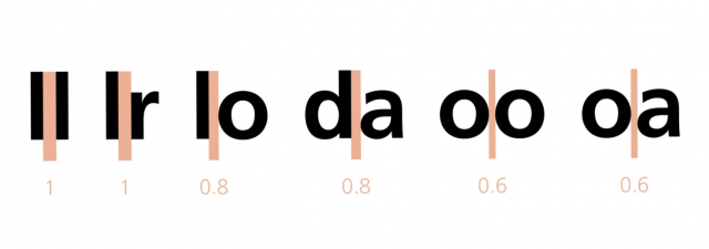
In fact, it is necessary to distinguish according to the shape: the unit of measurement will be established by the meeting of two letters that we can define straight , like two "L". The space between two "L"s, therefore, equals one.
Following this criterion, when we find a straight and a rounded letter side by side (an “l” and an “o”, but they could also be a “d” and an “a”) we can identify this space by assigning it a slightly lower value than a 'unit.
If then two round letters meet, the space is still slightly less than that between a straight letter and a round one.
Following this criterion can be very useful for you to become familiar with kerning , because you get used to assigning a space to the different shapes of characters.
Proceed in groups of three
Since, as you have already seen, it is a question of optically correcting a standard measure, it is usually very difficult to do it by dominating the whole word or the whole line at once.
A trick to work better is then to proceed in groups of three . Then adjust the kerning for the first three characters of the text you're working on; when you've got a good result, scroll one, then work on characters #2, 3 and 4 .
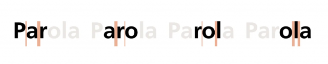
So on until you're done. In this way you will be able to concentrate on the right distance between the fonts and at the same time maintain an overview that leads you to harmonious results.
Beware of evil couples
There are font pairs that cause more problems with kerning.
In particular Va, Fo, Ta, AV, AT, AW, and in general always W, Y, V, T, L, and P (uppercase), as well as yek (lowercase).
Since they are problematic fonts, the advice is to focus on these first , and only then move on to the other fonts.
Work upside down
Our brain is an amazing machine, sophisticated but sometimes difficult to control.
When we read a word we know, in fact, not only does our brain focus on the meaning , but out of habit it also tends to complete its form.
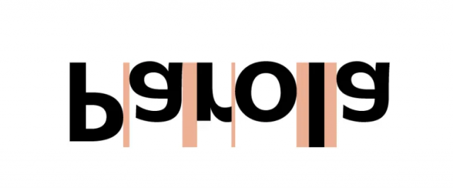
Think of captchas with all distorted fonts: they exploit this very mechanism, because our brain is able to bring them back to a known form (while the computer doesn't, at least a few years ago ... then AI arrived).
If you want to screw your brain and focus better only on the visual aspect of a word there is a solution: turn it upside down!
With the writing turned upside down, your brain will have a much harder time recognizing the word and will be forced to focus on the visual elements.
Less is more
Ok, we always say this, in every area and nuance of design.
But it can help you for kerning as well. This basically means that it's best to avoid overworking or customizing kerning.
Often a few targeted, “surgical” interventions are enough . Because if on the one hand it is true that operating on kerning serves to introduce the optical corrections necessary to accommodate the shape of the fonts, on the other hand going to completely break the pattern of font design could prove counterproductive.
Kerning varies with font size
Have you fixed the kerning of your text and now resize it for another use?
It's not a good idea! Since kerning regulates an optical effect, this effect varies with the size of the font. So it's best to focus on kerning only after you've established the size of the font you're going to work on.
Remember, as a general rule, that smaller dimensions should equal larger kerning .
Adjust kerning only at the end
This last tip connects to the previous one. Once again since we are talking about an optical correction it makes no sense to intervene on the kerning until the lettering has been completed in every other aspect.
Only when you have finished your project in all respects will you be able to make the really necessary corrections. Otherwise, you risk having to do the kerning job all over again.
When you subscribe to the blog, we will send you an e-mail when there are new updates on the site so you wouldn't miss them.
About the author
By accepting you will be accessing a service provided by a third-party external to https://www.insightadv.it/


Comments