
When and why prefer black and white?
Black and white adds a timeless, artistic appeal to an image. We see and live in a world of colors. This is how we evolved, and this is what we know. Naturally, people are drawn to color photography like children to candy, drawn to images full of vitality. Our affinity for color can also manifest itself in our language. We use the word "colorless" to describe a dull, dull, or boring thing or experience. So why take black and white photos and prefer black and white photos, when today's digital technology makes color management so easy?
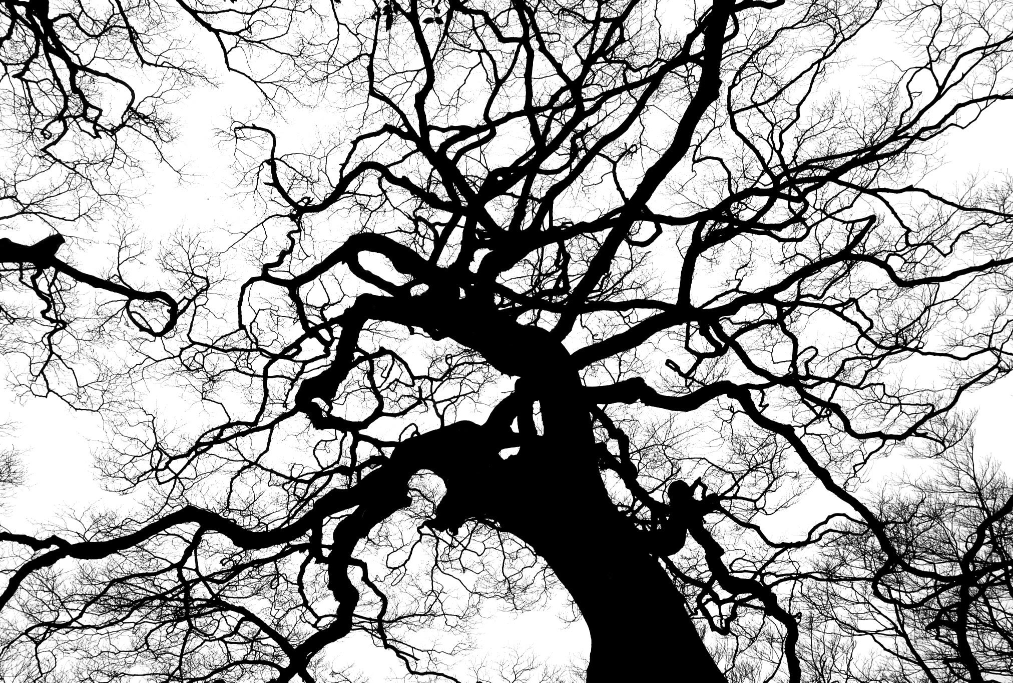
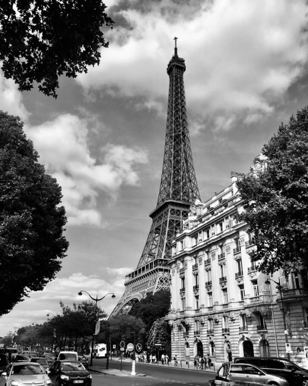
Black and white is timeless, but more than that it transcends reality and transforms an image into a realm that is neither abstract nor reality. A black and white image deconstructs a scene by reducing it to its shapes and tones. Distracting colors are recast as subtle shades of gray that add something to the composition, at least if the image has what it takes to be rendered in black and white.
Personally, I love good black and white images. In fact, as a viewer of photographs, I've been most moved by good black and white images that have wide tonal ranges and deep, rich blacks. There is something that attracts me. I believe black and white has an important place in photography today, and I see two clear reasons for experimenting with such a “narrow” palette: it is easier than ever, and it allows us to look at our subjects more deeply, expanding the possibilities of our photography.
Black and white photos: the Leica case
In 2015, Leica released a cool ad. It was for a special product in their line; a digital camera that takes only black and white photos.
The clip itself was strangely gripping. Set to mesmerizing black and white motifs, a calm voiceover says that black and white is purer than color . The hyperrealism of color, he points out, isn't just overly crass, it's pointless. Color is an aid for people without imagination: "In the world of colour, there is no room for dreams".
Of course this is wrong. If anything, it's the opposite: color is real, we don't see in monochrome. Insisting on black and white is often a pretentious turn. Leica's announcement revives one of the oldest debates in the history of photography: which is better, black and white or color? In my opinion they are different shots and the question is not so relevant. However, it is useful to know about this *controversy* to get to know photography and its history a little better.
Understand black and white photos knowing the history
Let me remind you that photography has only relatively recently become an art form. When she was born in the late 19th century, observers had considered her "too literal to compete with works of art" because she was unable to "elevate the imagination." Leica's advertising used the same line of argument – that something too realistic couldn't be artistic.
In the beginning, photography competed with fine art: It required long exposure times and used heavy, static equipment. The most popular subjects were landscapes and portraits – both hallmarks of painting.
Portable equipment or rolls of film (a blessing compared to the cumbersome cameras or glass plates used before) only became available around World War I. This allowed photographers to take pictures in previously unimaginable environments and to differentiate the medium of photography from painting.

Pioneers like Henri Cartier-Bresson and Helen Levitt did this by employing realism in unexpected ways. With their “defining moments” and unexpected subjects they froze the unseen, demonstrating that photography was about beautiful compositions and subjects very different from painting. The aesthetic of the snapshot emerged. Street photography was born.
These now legendary photographers learned their craft in a black and white world. Which is to say, every time they took a picture, they knew it was going to be black and white. The abstraction was a natural quality of the image – just like the two-dimensionality of the shot.
Color photography only became practical in the mid-1950s after film manufacturers invented processes that made color images easy enough to develop. It was another technological shift that changed the medium, just like the handheld camera and film before it. And perhaps inevitably, photographers now assumed the role that the defenders of painting had before them: They refused to embrace the new technology.
Rather than enjoy their sudden ability to depict the world more realistically, fine art photographers eschewed color. In their minds, serious, documentary and fine art photography was meant to be shot in black and white. Photography legend Henri Cartier-Bresson, known for his evocative monochrome shots, even said that “color is bullshit”.
Why would Cartier-Bresson dismiss color so starkly? Most likely because black and white works differently than color .
Subjects that look great in black and white often don't look great in color. It's for the same reason that brightly colored images look dull when desaturated. Images from the historical photographic canon were made for one palette or another. You see and shoot in the same color or B&W as the camera's film or sensors.
“Colour negates all the three-dimensional values of photography”, Cartier-Bresson would later affirm. Black and white was not limiting for him – photographers of the time knew how to use it.
The way these photographers photograph also explains their position when color arrived on the scene. The color forced them to look differently. After experimenting with polychromy, Cartier-Bresson is said to have been unhappy enough to destroy his negatives (and in fact continues to be known only for his monochrome works).
In 'Understanding a Photograph', John Berger wrote that 'paintings, before the invention of photography, are the only visual evidence we have of how people saw the world'. I'd argue that even black and white photos, before the invention of color photography, give us a hint of how photographers saw the world: In beautiful shades of gray.
Just as black and white appears reduced to our eyes today, color must have seemed garish to 1950s photographers: It looked like an embellishment. As advertising photographers embraced color, artists' scorn only grew. In 1959, Walter Evans said: " There are four (six in Italian) simple words to the matter, which must be whispered: Color photography is vulgar ".
Today, this position seems absurd. Color photography has long been the standard way of photographing the world. What happened was another paradigm shift, or even a small rebellion.
While fine art photographers turned up their noses, color film quietly conquered the global mainstream. In the postwar years, photography transformed from something only professionals did to a hobby for amateurs. The invention of color Kodachrome film in 1936 and Ektachrome in the 1940s led to a gradual and popular adoption of color photography.
In the black and white years, being a photographer meant developing your own film, cropping your images and making prints. Processing color photographs, by contrast, was too complicated for many professional photographers – but it lent itself perfectly to amateurs, who simply had their photos developed in a lab.
Above all, taking black and white photos had to look more realistic. Black and white “raised a photograph from banality to a work of art,” but hobbyists only wanted to take realistic family photos. William Eggleston once summed up what must have been on many people's minds at the time and which we have come to accept: “ The world is in colour. And we can't do anything about it ."
Along with Saul Leiter, Steven Shore, Joel Meyerowitz and others, Eggleston is widely credited with pioneering color in the arts. In the 1970s, these (and others) photographers made the switch from black and white to color – despite fierce opposition. Meanwhile, photography legend Paul Strand told Shore that shooting in color was a "disastrous career move."
The change was now underway. And it's no coincidence that artists like Eggleston and Shore managed to photograph mundane subjects in interesting ways, and it was their use of color that helped them do so. The transition from black and white to color was a transition from presumably salient subjects, such as the photojournalism championed by Magnum, to the more poetic everyday object.
At first, nobody wanted to see this kind of work. Now, the early exhibitions of these photographers are legendary. It took some time for the art world to wake up to a new type of subject matter and to color photography. While black and white made the mundane artistic, the pioneering color photos succeeded precisely because they were mundane: they alerted the general public to the hidden beauty in everyday life.
But then… what is better?
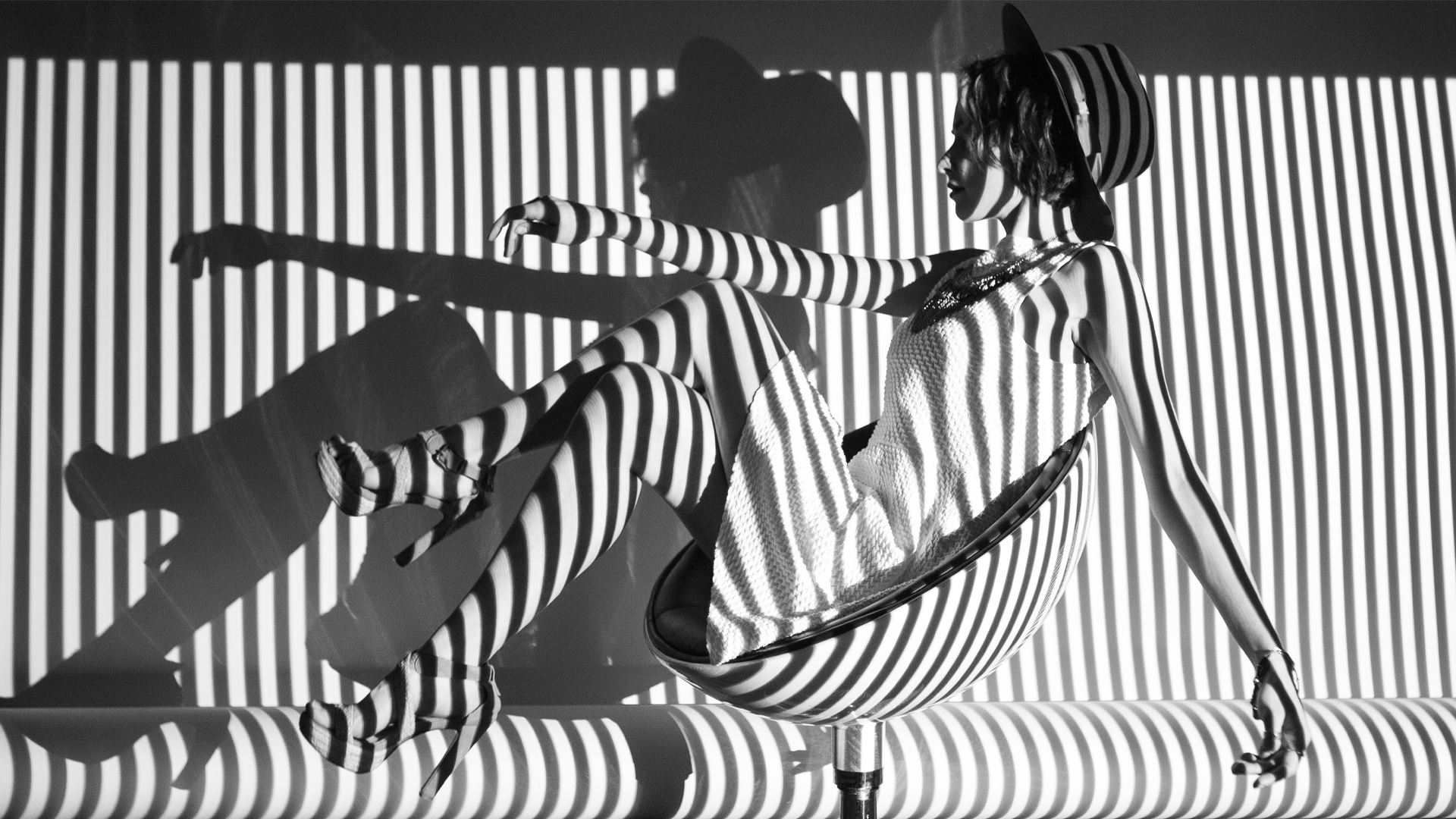
Color is no longer controversial. It's just the standard . Today, black and white is mostly used by photographers who love the classic look, or in fashion shoots that emulate the modernist style, or by advertisers who want to convey a vague notion of class and sophistication.
This does not mean that the dispute has been fully resolved, nor can it be. It's not about being right or wrong, being realistic or snobbish, forward-thinking or old-fashioned. The controversy is fundamentally about how the human imagination is thought to work – or how it should work.
“Color is not a question, but rather an answer,” said Joel Meyerowitz. For a photographer, it is one decision among many others, all part of his way of seeing and interpreting the world.
RAW files and the new golden age of black and white
In the spirit of full disclosure, I'm not against color. In fact, I love my 4k color TV and color photography. But there are some subjects that reveal themselves best when we turn them into monochrome images.
For many, the days of Ansel Adams are remembered and revered as a time of high art photography, and the black and white images are reminiscent of a lost era of the craft. The tools have changed, but the same sense of craftsmanship endures. Instead of the wet darkroom with all the chemicals and mechanical tools, we have a digital version that makes black and white photography more accessible while retaining the need to be a craftsman.
I use Adobe Photoshop Lightroom and Adobe Camera Raw for my black and white conversions, and I'm often surprised at how quickly I can produce dramatic and special results. I can produce black and white photos with deep tones and rich contrast in moments. Having this ability frees me up to focus most of my efforts on finding a meaningful image.
What's really revolutionary about creating black and white today is that we do it using RAW files . If your first camera wasn't digital, you remember that you were forced to decide what film to put in your camera long before shooting. This was a big decision. But with RAW technology, we are freed from these painful decisions at the time of shooting. RAW converters allow us to decide after the shot whether we want a neutral or high-contrast look. Also, we can create many, many black and white versions of the same file. We can create warm and cold toned versions or emulate films like Agfa Scala , Ilford HP5 or even Kodak Panatomic-X . And with all the versions we can create in our RAW converter environment, experimentation never alters the integrity of the original image file . You can always reset whenever you want. It has never been easier to experiment with all the different possibilities.
The joy of discovery (and the emotions that follow)
I find the most compelling argument for shooting in black and white today is the way it allows photographers – and photo viewers – to explore some of the more basic elements of composition, structure and form. A color photographer often relies on contrasting colors to create separation between elements within a frame. With black and white, we don't have that luxury. Instead, we consider the contrast of light, simplistic negative spaces, textures, lines and shapes. This rigorous focus helps expand our understanding of what we're shooting and what we're seeing.
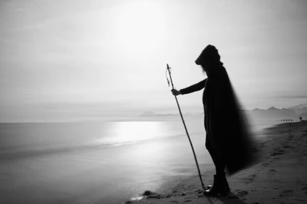
Speaking of emotion and how much power can be conveyed in a single black and white image, we simply have to talk about how powerful a portrait without color can be. As photographers, we are artists, whether you like this title or not, and the images we create will make one impact or another. The choices we make behind the lens and in the darkroom, whether real or digital, can take a stark negative image of something or someone and turn it into a piece of art that can literally change someone's life. There are countless examples of when a photographer takes his gallery of color images and simply transforms them into grayscale. With all due respect to those who do, I think there is an inherent difference between that and processing an image specifically for a black and white display. Consciously choosing to remove color, particularly in portraits, seems to have a stunning effect.
In essence, not only does black and white photography seem to have a very relevant place in our world today, but perhaps a necessary place as well. We are emotional creatures; there's no point in even trying to deny it, and these emotions can help us connect with each other in more powerful and meaningful ways. Photography is one of those realms where very strong connections can be made, and the purposeful use of black and white images can facilitate those connections.
See differently
It's relatively easy to understand how black and white can reveal different things to the photographer and the viewer. As nature photographers, we can develop and use our ability to see in black and white to our advantage, expanding our aptitude for seeing the potential of what is in front of the lens. Color is the most obvious element of composition, but shape, line, and texture can separate a great photo from something truly special. Thinking in black and white will train your eye to spot the full potential of a landscape or nature portrait.
The zone system for the DSLR
Many black and white photographers use the Zone System made famous by Ansel Adams. The system allows us to control the process and produce prints that show exactly what we envisioned when the initial exposure was made.
The Zone System divides the tones in a black and white print into 11 main tones from blackest black (Zone 0) through medium gray (Zone V) to paper white (Zone X). If you expose according to the reading of a reflected light meter, anything you take the reading from will be placed on Zone V. You can move the subject being measured up or down the tonal scale giving more or less exposure than the reading suggests of the meter; the Zones are one stop from each other. When used with film, the zone system also provides test procedures for determining the effective speed for the film in use, and for determining the degrees of development needed to produce varying degrees of contrast that move the higher regions toward the up or down the scale as the photographer's view of the scene being photographed requires.
Digital imaging actually provides much more control over images, through in-camera controls and especially post-processing. Image reproduction and histograms give the digital worker something the photographer never had: instant feedback. Keep in mind, however, that the playback image and histogram are based on JPEG images processed by the camera, not RAW data – even if you're shooting in RAW.
When you subscribe to the blog, we will send you an e-mail when there are new updates on the site so you wouldn't miss them.
About the author
By accepting you will be accessing a service provided by a third-party external to https://www.insightadv.it/


Comments