Rebranding: the Epic Fails of some big brands

In recent days, we have talked about rebranding , explaining what it is and how and when to do it. In fact, we have all seen Rebranding – Zara which reduces the spacing between the characters of its brand, McDonald's which eliminates the red color from its iconic logo, and again Apple which praises minimalism by eliminating the multicolor from the bitten apple – but despite full the market does not always go according to plan. In this article you will find some Epic Fail of big brands and how to learn from their mistakes.
Failure cases
My father (? I think it wasn't his copyright) always said that you learn from mistakes – even if they are those of others – for this reason, let's see some cases of Rebranding that were better to avoid:
Pepsi

Do you see the smile?
Pepsi has been fighting for its identity since its inception - we know very well that its main competitor does not let go - and the evolution of the brand is a story that began several years ago but the experience in the field of Rebranding was not enough to make a Good work.
Its latest version was released in 2008: changing the font and rotating the logo, the idea was to make it a " cheeky smile ", have you noticed? Many are not convinced and have left room for creativity.
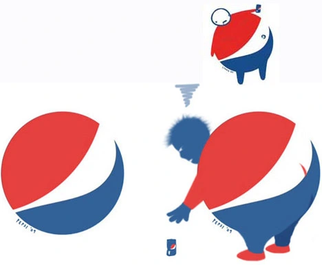
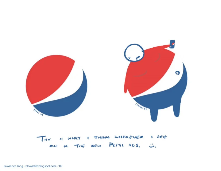
The white stripe on the new logo varies across Pepsi products, getting wider or thinner depending on product. The design team that sparheaded the campaign explains that they're supposed to be “smiles”, but we don't really see it.
– Forbes Magazine
Kraft Food
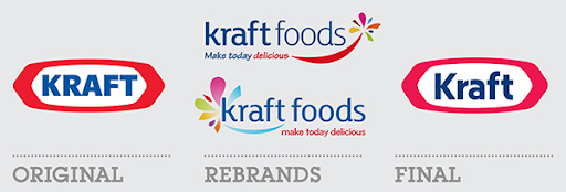
The international Food&Drinks company changed course, but only for a short while. Consumers, without hesitation, dismantled the enthusiasm for the change, after only 6 months Kraft decided to retrace their steps (or almost) to recover the lost identity .
But what would be so wrong with the new logo, so different from the original? Maybe just that!
Consumers' perception of the original brand was defined as a powerful and immediately recognizable "smack in the face" , with the Rebranding instead the brand changed energy resulting generic and pathetic, also thanks to the choice of fonts, Tekaton and Papyrus, highly questionable.
Tropicana
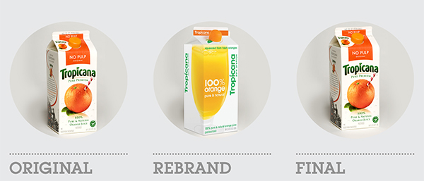
In 2009 the company launched into the market with a drastic rebranding, modifying the packaging, logo and communication style, but all these efforts could easily have been avoided.
Consumers were faced with a product they no longer recognized and therefore stopped buying it. This generated a 20% drop in sales for a value of 30 million dollars, the collapse of brand awareness, as well as negative consequences for the corporate reputation.
A nice gift for the competitors who have grabbed the market shares of the American giant. But this nightmare didn't last long, in 2009 Tropicana restored its old logo returning the flagship product among fruit juices.
MasterCard
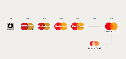
Even the best ones make mistakes, Mastercard* in 2006 had the (not so) brilliant idea of rebranding its recognized brand. This remake cost the company nearly $10 million which was better invested in other businesses. In fact, the public did not appreciate the change, defining the brand as confusing and unclear. Here the multinational took a step back by re-adopting the old characteristics of the brand.
Royal Mail
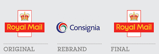
A not irrelevant leap into the void for the Royal Mail * - the British postal service, initially only for the royal service - which in 2002 drastically changed its name to Consignia , creating confusion and difficulty of recognition , also thanks to the almost absent communication campaign. Royal Mail, however, bounced back in just a year aware of the mistake.
5 tips for an excellent Rebranding strategy
From the cases of failure just seen, we can draw conclusions on how it is good not to rebrand:
- Make it easy: simplification instead of complication , this is a fundamental rule, especially when the logo is international. It is important to make the logo more understandable and clear, without inserting superfluous elements that would end up complicating it;
- Changing logo is a gamble , and we're not playing here. Every activity that requires an effort, in this case making the consumer recognize and associate the new logo with the company, is not appreciated by our brain which doesn't feel like making an effort. So it can be done but only if strictly necessary;
- But…before starting with the Rebranding, make sure you understand the perception of the brand and the product in the minds of consumers , and ask yourself if it is really necessary to act;
- Make sure that every Rebranding activity is always followed by a communication campaign , especially when the activity is radical;
- Don't forget the values and mission that accompany your brand, these must be transferred to the new logo.
To conclude, the Rebranding activity is not easy and, despite experience, things do not always go according to plan. There are no right or wrong actions, there are different circumstances that must be evaluated before acting, analyzing the competitive environment and any pros and cons that the strategy can bring with it.
Improve the emotional connection
But if you don't understand what Rebranding is, here's the answer.
Let's start from the basics: Rebranding is a marketing strategy that aims to reposition an existing brand on the market and in the minds of consumers. This occurs concretely with the modification of the identity of the brand or of the distinctive signs of a company such as, for example, the logo or the communicative style.
Rebranding is a dynamic strategy that can take place both in a short time and over a longer period of time and can be both radical and almost imperceptible in the eyes of consumers.
Not only that, Rebranding can be Proactive when the choice to act starts from the company itself, to improve, grow or conquer new market shares or Reactive when it is the external circumstances that "force" to act to resist and ride the market trends .
So in conclusion, why should a company rebrand? Simple:
- The public or the company has changed and the brand identity no longer reflects the business and the target consumers no longer feel represented by that corporate image;
- The Logo is obsolete when the graphics are no longer current;
- Trends evolve and to follow the needs of consumers it is necessary to keep up with the change so as not to be obsolete;
But someone did it:
In addition to having seen how NOT to do it, we must also learn from the best. Here are two success stories you've most likely noticed:
McDonald's no longer serves low quality food
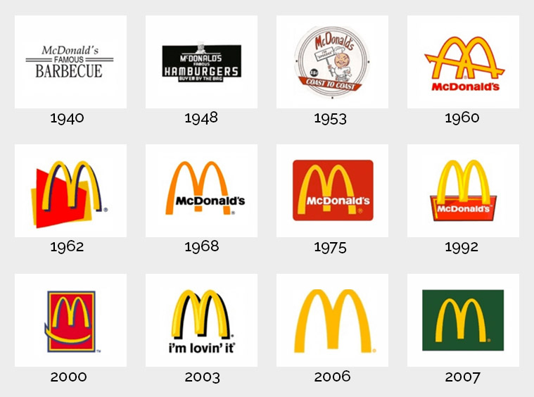
The most famous fast food chain in the world is labeled as a food distributor where quality is not its strong point. However, over the years, McDonald's has understood that adapting the offer to the demands of its consumers was essential in order not to lose its competitive position. From the beginning of 2000, in fact, it began to serve healthier foods, and to make consumers perceive these changes, it also decided to intervene on the logo, the famous yellow "M" flanked by the color red does not communicate the company's choice in an optimal way. here is that the red color is initially removed, and then the green color is inserted, the color of nature.
Dropbox
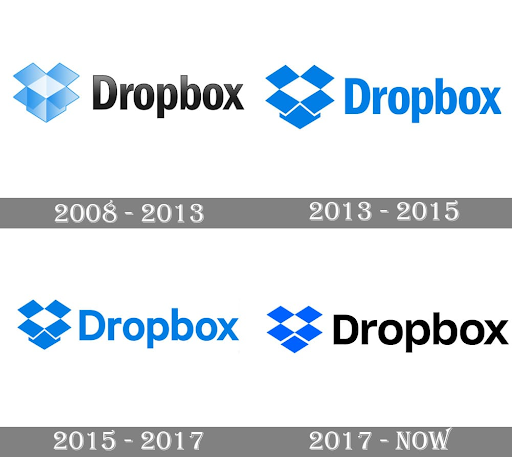
Dropbox Inc. it didn't go with leaden feet, the evolution of its logo began in 2008 and ended in 2017, slightly modifying all aspects of the brand. In particular:
- The box, previously three-dimensional, is now flat and without depth;
- The color palette, previously faded on both the writing and the logo, has been replaced by flat colours;
- The font is simpler and easier to read.
This is an example of Rebranding that is difficult to perceive as the changes have not been drastic, but nevertheless an excellent job has been done, simplifying the perception of consumers by eliminating elements of confusion.
When you subscribe to the blog, we will send you an e-mail when there are new updates on the site so you wouldn't miss them.
By accepting you will be accessing a service provided by a third-party external to https://www.insightadv.it/


















Comments