The 10 commandments of visual communication
Visual communication is the transmission of a message through an image (therefore it is sometimes called iconic communication, from the Greek eikon, "image"), which metaphorically represents reality. Communication through images allows you to achieve the maximum communicative effect in the shortest possible time, thanks to its strong appealing power, its immediate comprehension and ease of memorization. The iconological approach allows us to deal with signs: elements that mean something else than the phenomenon itself.
In everyday life we are confronted with countless examples of visual communication. Let's think, for example, of horizontal and vertical road signs , or of the indicator signs present in large meeting places such as hospitals and airports. In the design and creation of any type of poster design, it is essential to predict their communicative effectiveness.
At the corporate level, visual communication is essential for the success of any company , large or small. Making yourself stand out , enhancing your strengths and communicating them with an image is not obvious or even simple, you need study, analysis and graphic synthesis skills. It can also be critical in the phase of defining a logo, studying a packaging , a catalog for distributors and in many other occasions, alongside all the rest of the marketing and commercial actions to obtain the success of one's product or service . A good image , in fact, gives great value to the brand , makes it known, recognized and distinguished from competitors , adding commercial value to the service or product offered by the customer.
But how can we be sure of creating effective visual communication? Let's start by lining up the 10 basic rules that it is essential to follow.
1- COLORS
Consider the color wheel your ally and try to use complementary, contrasting colors or the rules of the triad . In general, it's better to use colors sparingly : no more than 3 in a single layout, maximum four, so as not to create a carnival effect, which is highly demeaning from an aesthetic point of view and, above all, from that of the clarity of the message. And if you can work on shades instead of colors, so much the better.
The choice of color must be considered , starting from a logo and the consequent coordinated image (website, business cards, tools, etc.). Choosing the wrong color runs the risk of us communicating the wrong message as well . In fact, colors generate a psychological response, have a meaning in various cultures and represent a message. Color has been shown to have direct effects on perception (particularly that of the taste and palatability of food), mood and behaviour.
2- TYPOGRAPHY
Get to know font families , play on contrasts without choosing fonts that are too different from each other. Choose a maximum of two fonts and weigh wisely the use you want to make of them. And please, don't use the Comics.
There are two broad families of fonts: serifs ( Serif ) and sans serif ( Sans Serif ). The graces are ornamental frills at the ends of the letters. A well-known, but also rather banal, serif font is Times New Roman (probably the most common Sans Serifs are Verdana and Calibri). When choosing the font for our graphics, it is always good to keep in mind that some of them make it difficult to distinguish some letters such as the uppercase letter i (I), the number one (1) and the lowercase letter elle (l).
Generally, web readers prefer sans serif fonts especially for long texts. We could make an exception by using serif fonts for titles because they are short and usually fit on one line.
3- SHAPES
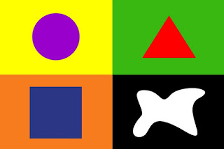
All forms communicate. Learn to use them in the right place at the right time. The eye of a normal internet user or, more simply, of a user of a communication message, has learned over the years to associate a specific meaning to each shape . It is part of non-verbal communication, recognized globally. For example, the triangle is a shape that inspires dynamism that stimulates action (for example arrows), but it is also aggressive. The circle, on the other hand, is a sign that projects a positive and reassuring image onto the user.
4- HIERARCHY
It is important for you and for your client to govern the reading of a web page. This is possible by respecting a hierarchy between the various contents. A triangular view is preferable when you have few elements, the golden proportion helps create a pleasant environment, while if you want to focus on a particular element, such as a button, highlight it compared to other content that could distract navigation. Remember that viewing a page is a matter of seconds and it is therefore very important to get to the point as soon as possible . Precisely for this reason we cannot afford to disperse our reader's attention, both with graphic aspects and with misleading copywriting tricks. It would be very wrong to use bolds randomly, as well as highlights, which must be used sporadically to have the desired effect. Elegance and effectiveness rhyme with simplicity .
5- LINES
The layout of paper tools and web pages must be studied by meticulously distributing the dimensions . As with shapes, lines also communicate , which is why if you want to get straight to the point, it's better to be linear, both horizontally and vertically. While if you want your user to follow a certain path you can guide him with converging or diverging lines. Rhythm is also important so respect the rules you have given yourself in terms of spacing, proportionally to the size of the fonts.
6- ICONOGRAPHY
From the point of view of visual communication, iconography has a strategic value : that of communicating a message immediately and across the board. A symbol, in fact, is like an ideogram: it should be able to be immediately converted into words, even in the absence of an official coding. For this reason it is important to refer, as far as possible, to the most widespread iconography. If we take advantage of the natural mapping between the action that can be performed and the icon that must represent it, we obtain intuitive icons that reduce the user's interpretative effort to a minimum and do not force him to learn anything new. An example of natural mapping applied to icons is the use of the "basket" or "cart".
Therefore, given the assumption that we will refer to universally recognized and immediately understandable icon models, what we can do to make our visual communication less trivial is to create customized icons , for example that recall the social colors of our company or that take up an element graphic of our logo and which, necessarily, maintain a style consistent with that of the rest of our communication.
7- CONTRAST
Contrast is very often an option you can give yourself to separate or highlight content , especially in text: try playing with "bold", "light" within the same sentence. Even the different layout can be useful on a page to guide reading and stimulate interaction, for example a contact form that enters from the side.
In the chromatic choice, opt for two complementary colors – i.e. which, if juxtaposed, reach their maximum degree of brightness – we will obtain an effect of sure impact. From a physiological point of view then the eye requires the integration of each color with its complement and, if it does not exist, it represents it as if it were there.
Complementary colours, used in the right quantitative ratios, give solid static effects. In fact, they keep unchanged not only their luminosity, but also their chromatic essence. Wanting to take full advantage of the contrast of the complementary colors, in addition to the pure colors, their intermediate gradations can be used in a mediating and balancing function because with their affinity to both contrasting colors, they unify them in a homogeneous complex .
8- ORDER
The elements must be aligned in some way. Give yourself a rule and follow it like a mantra. Create a grid where to work and insert the elements respecting hierarchies and weights, or, if you prefer, align everything in the center. The important thing is to choose a reading rule. It would be hateful for the user to have to reset his reading style page after page, on the same website.
Most of the information that a system transmits to its user is conveyed by video displays of various shapes and sizes. The usability of these systems therefore depends considerably on their graphical interface .
9- WEIGHTS
Pay attention to the weight that the text must have. Few but careful choices make the difference. Also from an SEO point of view, it respects the rules h1, h2, h3, ... It goes without saying that, in addition to evaluating what is more and less important and consequently evaluating its visibility, the quantities of text and images will also have to be balanced, based on of the goal of the page we are building.
The communication designer must make calculated decisions about how to prioritize content and guide users, creating pathways to take them in the desired direction . Must pay attention to the weight of graphic and text elements and distribute them appropriately.
10- SPACE
The web page is the blank sheet that you must know how to fill, without exaggerating. White space also matters. Don't get carried away by filling the entire space with images, texts, buttons that only create confusion and disturb the view. Warning, don't even be too minimal , or you may not be understood. It really depends on the type of site you want to get and the sector you belong to. There is a link between the two, as the user has expectations that must be met. A bit like in the case of geometric shapes.
Why is the so-called Native Space (empty space surrounding a visual element) important? Because our graphics need air to emerge and be truly effective in communicating the concepts we intend to convey. Filling a layout too much means significantly limiting the visibility of each element, and will therefore be counterproductive in terms of communication.
When you subscribe to the blog, we will send you an e-mail when there are new updates on the site so you wouldn't miss them.
By accepting you will be accessing a service provided by a third-party external to https://www.insightadv.it/








































Comments